

Tutorial: A Filterable Partner Directory Pro
Turn a long list of partners into a page visitors can actually use: filter by type, search by name, load more as they go, and open a details popup for each one.
A partner page with 60 logos in one block is a wall. Nobody scrolls it; they skim the top row and leave. A directory works because it answers the visitor's real question, "which of your partners work in my area?", in one click. This tutorial builds that with the Grid block and explains why each piece is there.
Time: about 25 minutes You'll use: Grid · Logo categories · Ajax Live Filter · Ajax Search · Pagination · Display Elements · Tooltips · Logo Details popup
Pro features
The Grid block itself is in the free version. The filter, search, pagination, titles, tooltips and popup used here are Pro. See Free vs Pro.
What you're building
A grid of partner logos, six across on desktop, with category buttons and a search box above it. Twelve logos show at first, with a Load More button for the rest. Each logo has its name underneath, a short tooltip on hover, and opens a details popup with a description and a link.
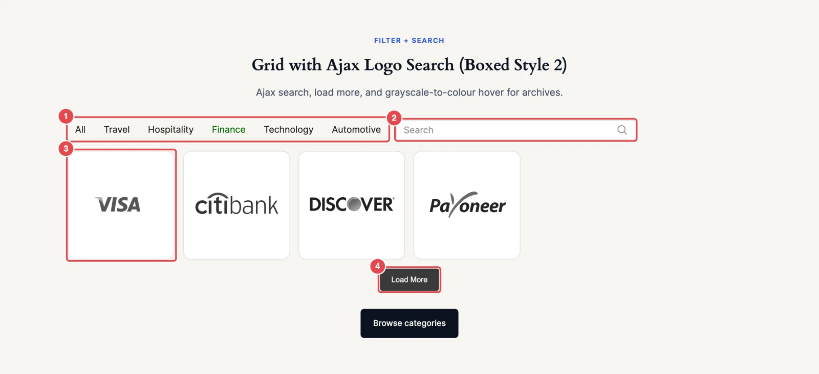
Before you start
- Collect what you'll show for each partner: logo file, name, a one- or two-sentence description, website URL and a category.
- Decide your categories up front. Five to eight short ones work best: Technology, Agency, Reseller, Nonprofit. Write the list down and spell them the same way every time. "Reseller" and "Resellers" become two separate filter buttons.
- Give logos consistent files, as in any logo layout: transparent background, even padding.
Step 1: Insert a Grid and add the logos
- Edit your partners page, click +, search for Grid and insert it.
- On Create Your Logo Showcase, click Start Blank.
- Click Upload Logo Images or Media Library and add all your partner logos.
- On Selected Logo Images, drag them into a sensible default order (alphabetical is easiest to scan), then click Continue.
We're using Grid rather than Carousel on purpose. In a directory, people compare and scan; everything should be visible without waiting for slides. A List or Table is a good alternative if your descriptions are long and you'd rather show them inline.
Step 2: Fill in each partner's details
This is the step that makes everything else work. The filter, search, tooltip and popup all read from these fields.
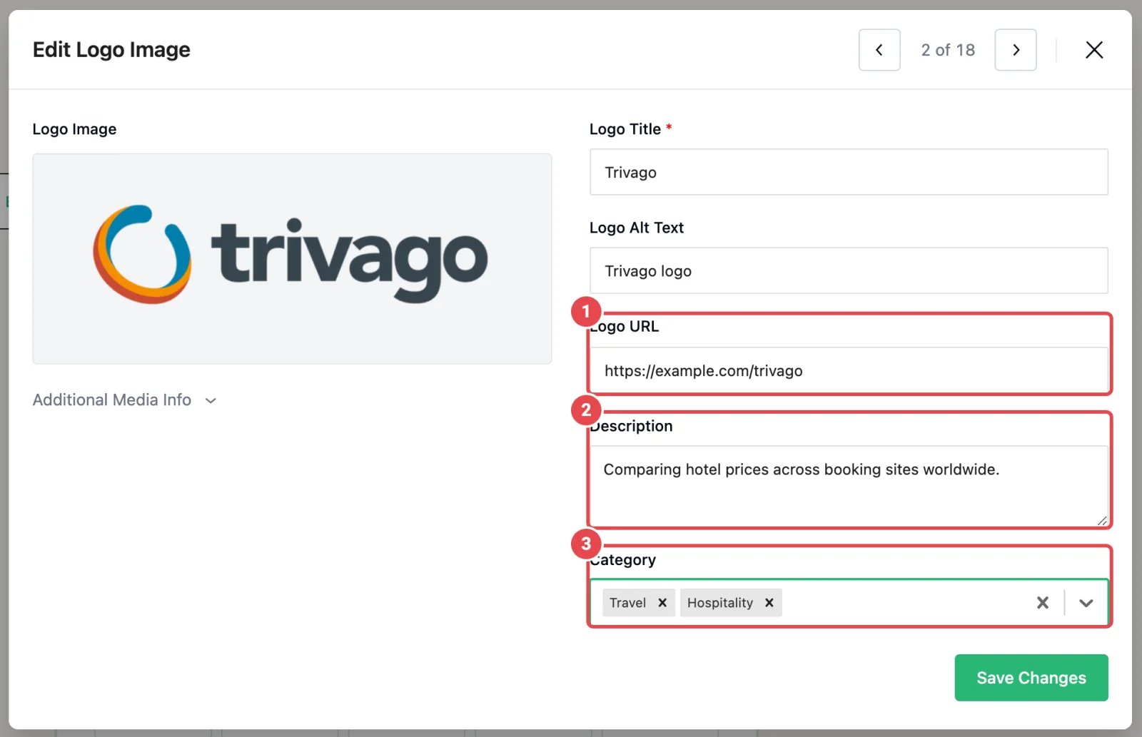
- Click the pencil on a logo (or click Edit Logos in the block toolbar) to open Edit Logo Image.
- Fill in:
| Field | What to enter | Used by |
|---|---|---|
| Logo Title | The partner's name | Title under the logo, tooltip, popup, search |
| Logo Alt Text | Name logo | Screen readers, search |
| Logo URL | Their website, starting with https:// | The popup's Visit Link button |
| Description | One or two sentences on what they do with you | Tooltip and popup |
| Category | Type a category and press Enter, or pick one already used | The filter buttons, search |
- Click Save Changes and use the arrow (or →) to go to the next logo.
Categorise many logos at once
In the Logo Images panel, tick several logos in the sidebar grid, click Category in the bar that appears, choose or create a category, and click Apply. Much faster than one by one. Details in Logo categories.
A logo can belong to more than one category, and it will appear under each.
Step 3: Lay out the grid
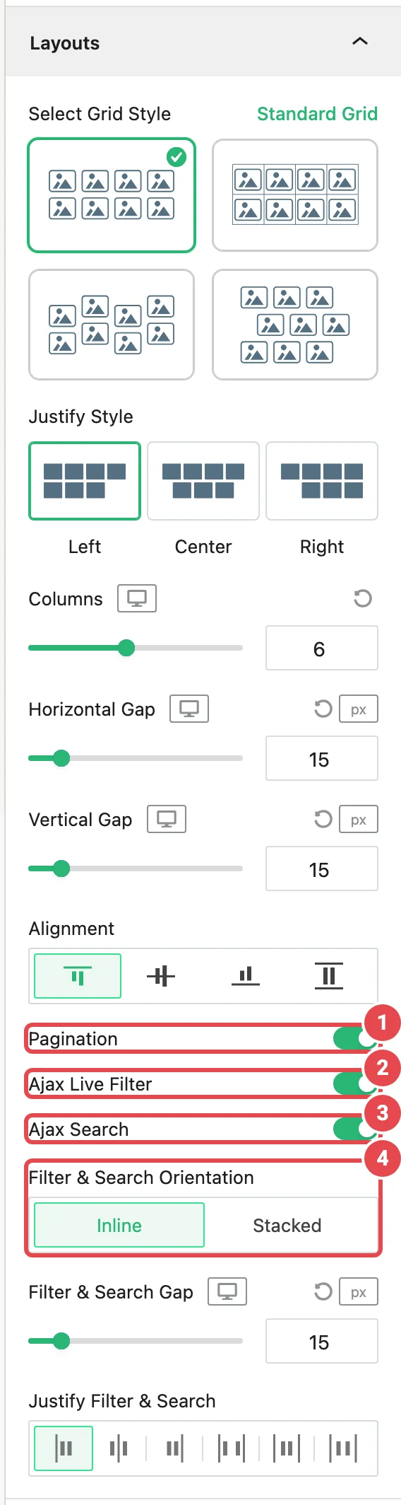
Open the Layouts panel.
- Select Grid Style: keep Standard Grid. Directories need predictability; save Zigzag Grid and Staggered Grid for decorative sections.
- Columns: 6 on desktop, 4 on tablet, 2 on mobile. Two on phones keeps logos and their names readable.
- Horizontal Gap and Vertical Gap: raise both to about 24 px. With names under the logos, cards need breathing room.
- Justify Style: Center, so a part-filled last row (common after filtering) sits in the middle rather than hugging the left.
- Alignment: Stretch, so cards in a row are the same height even when one name runs to two lines.
Step 4: Show names under the logos
Open Display Elements.
- Switch on Title. Each partner's name appears below its logo.
- Leave Description off. In a six-column grid, descriptions become cramped paragraphs. They'll live in the tooltip and popup instead.
- Set Alignment to center.
- Set Click Actions to Popup, so clicking a name also opens the details popup (you'll set up the logo click next).
On the Style tab, the cards have a light border and padding by default. Keep them: borders help each partner read as a separate item.
Step 5: Open a details popup on click
Open Logo Images and stay on its Settings tab.
- Set Click Actions to Popup.
- While you're here, set Hover Animations to Scale up for a small cue that logos are clickable.
The Logo Details popup shows the logo, the partner's name and categories, the description, and a Visit Link button when the logo has a URL. Arrows let visitors step to the previous or next partner without closing it.
Why a popup rather than linking straight to the partner's site? A directory visitor is comparing. Sending them off-site on the first click ends the comparison. The popup gives them the details and a link, and leaves the choice to them.
The popup only opens on the live page, not in the editor.
Step 6: Add the category filter
- In Layouts, switch on Ajax Live Filter. A new Ajax Live Filter panel appears.
- Open it and choose the Button style. Buttons are bigger targets than plain tabs and obviously clickable.
- Turn on Display Count, so each button shows how many partners it holds.
- Keep Show 'All' on and set Label for 'All' to All partners.
- Set Justify Content to Center, and Overflow Behavior to Scroll if you have more categories than fit on a phone screen.
Filtering happens in the visitor's browser, so it's instant and doesn't reload the page. Read more in Ajax Live Filter.
Keep Show 'All' on for a directory
If you turn it off, the first category is selected when the page loads and visitors never see everything at once. That suits tabs, not a directory.
Step 7: Add the search box
- In Layouts, switch on Ajax Search. An Ajax Search panel appears.
- Choose a Search Bar Style; the outlined field (Style 2, the default) fits most sites.
- Set Placeholder Text to something specific: Search partners by name.
- Set No Results Text to a helpful sentence: No partners match that search. Try another name or pick "All partners".
Search matches the logo title, categories and alt text, and works together with the filter: pick Agency, type north, and only agencies matching "north" remain.
Back in Layouts, with both switched on you get Filter & Search Orientation. Choose Stacked to put the search box on its own line above the buttons (clearer on phones), or Inline with Justify Filter & Search set to Space Between for a tidy single row on desktop.
Step 8: Add Load More pagination
Sixty logos at once is still a wall. Show a dozen, then let visitors ask for more.
- In Layouts, switch on Pagination. A Pagination panel appears.
- Keep Pagination Type on Load More.
- Set Logo Show Per Click to 12: two full rows of six. A multiple of your desktop columns means every batch ends on a full row.
- Set Button Label to Show more partners and Ending Message to That's all our partners.
- Set Alignment to Center.
Leave Load on Scroll off. Infinite scroll makes it hard to reach whatever sits below the directory, like your footer or a "Become a partner" call to action.
Pagination works with the filter and search: the button only counts partners that match. See Pagination.
Step 9: Add hover tooltips
A tooltip gives a quick preview before anyone commits to a click.
- Open Tooltips and switch on Tooltips.
- In the element list, keep Title on and switch Description on.
- Set Tooltip Summary Length to about 15 words, so the tooltip stays a teaser and the popup holds the full text.
- Leave Tooltips Visibility on On Hover and Tooltip Position on Auto.
On touch screens, tooltips open on tap instead of hover. See Tooltips.
Step 10: Publish and check
Publish the page and open it in a private window.
What done looks like:
- [ ] 12 logos in two rows of six, each with its name underneath
- [ ] Category buttons with counts; clicking one narrows the grid instantly, All partners brings everyone back
- [ ] Typing in the search box filters as you type, and works together with the selected category
- [ ] Show more partners adds rows; the ending message appears once everyone is shown
- [ ] Hovering a logo shows the name and a short description
- [ ] Clicking a logo or name opens the popup; Visit Link goes to the partner's site; the arrows move between partners
- [ ] On a phone: two columns, buttons scroll sideways or wrap neatly, the popup fits the screen
Variations
A dropdown instead of buttons
With more than about eight categories, switch the filter to the Dropdown style and set its Title Label to Partner type. It takes one line however many categories you have.
A table-style directory
Transform the block into a Table (block toolbar → transform). Your logos, categories, filter and search carry over, and the description gets its own column. Good when visitors compare details rather than logos.
Tiered sponsors
Use categories for tiers (Gold, Silver, Bronze), turn off Show 'All', and the filter behaves like tabs, opening on the first tier.
Common problems
| Symptom | Likely cause | Fix |
|---|---|---|
| No filter buttons appear | No logo has a category | Add categories in Edit Logo Image |
| Two buttons for the same category | Spelled differently ("Agency" / "Agencies") | Fix the spelling on the odd logos |
| The popup doesn't open in the editor | Expected | Check the published page |
| No Visit Link in the popup | That logo has no Logo URL | Add one, starting with https:// |
| No Load More button | All logos fit in one batch | Expected, or lower Logo Show Per Click |
| Search finds nothing for a partner | Search reads title, categories and alt text only | Check the Logo Title spelling |