

Table Pro
Line your logos up in rows and columns, with a heading row for the logo, name and description.
The Table block lays out each logo as a row, with its details in neat columns: the logo image, the name, and a description. A header row on top labels each column. It's the tidiest way to show a lot of companies side by side, like a vendor comparison, a supplier list, or a page of certified partners.

Pro block
Table is part of Logo Carousel Pro. On the free plugin you'll see it in the inserter as a teaser. See Free vs Pro.
When to use it
- A partner, supplier or vendor directory that visitors scan for a name.
- A list of certifications or integrations where each one needs a short description.
- Any page where you want the logos and their text in tidy, aligned columns.
If the text matters but columns feel too formal, try the List. If you only need the logos, use the Grid.
How to add it
- In the block editor, click the + inserter and search for Table. It's in the Logo Carousel category.
- Add your logos. See Adding logos.
- Give each logo a title and description in the logo editor (see Edit a logo).
- Use the Table Titles panel to rename the header row, and the Layouts panel to add stripes or lines.
Expected result
You'll see a header row reading Logo Image | Name | Description, with one row per logo underneath. Title and Description are switched on by default, so the columns fill in as soon as your logos have text.
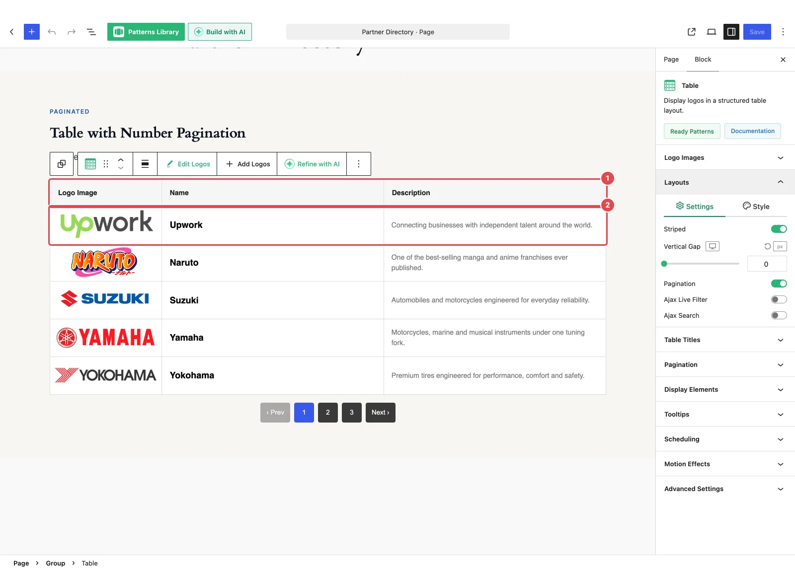
How the columns work
Table has one layout, so there's no style picker. Its columns come from the elements you've switched on in Display Elements:
| Column | Shown when | Header label (default) |
|---|---|---|
| Logo image | Logo Image is on | Logo Image |
| Title | Title is on | Name |
| Description | Description is on, and at least one logo has a description | Description |
A few details worth knowing:
- Read More doesn't get its own column. It sits under the description, or takes a column at the end if Description is off.
- Column order follows Display Elements. If you drag the logo image toward the end of the element order there, the image column moves to the end of the table.
- No descriptions, no empty column. If none of your logos have a description, the Description column doesn't appear.
On small screens
On tablets and phones, Table doesn't squash the columns until they're unreadable. Each column keeps a minimum width, and the table scrolls sideways instead. Visitors swipe left and right to see every column.
Layouts panel
The Layouts panel has two tabs.
Settings tab
| Option | What it does | Default |
|---|---|---|
| Striped | Shades every other row light grey so long tables are easier to follow. Rows sit flush with no gap between them. | Off |
| Vertical Gap | Space between rows, per device. 0–200px. Ignored while Striped is on. | 0 |
| Pagination | Splits a long table into pages or a Load More button. Adds a Pagination panel. See Pagination. | Off |
| Ajax Live Filter | Adds category filter buttons above the table. See Ajax Live Filter. | Off |
| Ajax Search | Adds a search box above the table. See Ajax Search. | Off |
When both Ajax Live Filter and Ajax Search are on, you also get Filter & Search Orientation (Inline or Stacked), Filter & Search Gap, and Justify Filter & Search (Inline only).
Style tab
| Option | What it does | Default |
|---|---|---|
| Table Line Style | The lines between cells: style, Line Thickness and Table Lines Color. | Solid, 1px, light grey |
| Background | The table's background, solid or gradient. | White |
To change the space inside each cell, use Inner Padding in Display Elements.
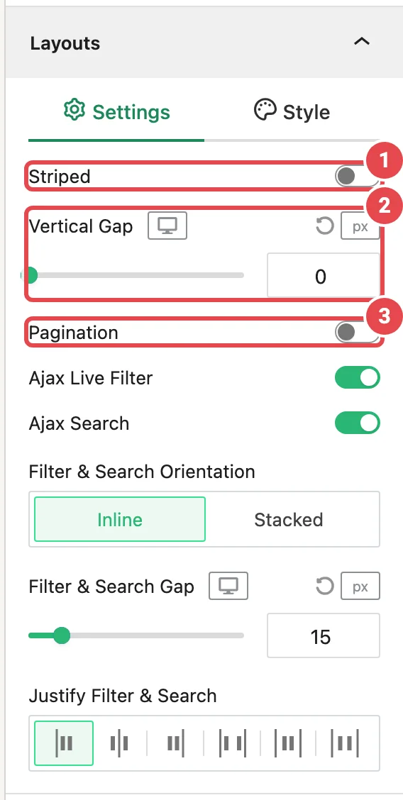
Table Titles panel
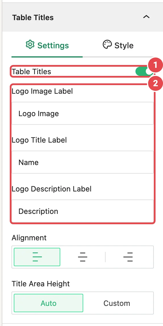
The Table Titles panel controls the header row. It's only on the Table block, and it's on by default.
Settings tab
| Option | What it does | Default |
|---|---|---|
| Table Titles | Shows or hides the header row. | On |
| Logo Image Label | Heading for the logo column. | Logo Image |
| Logo Title Label | Heading for the title column. Only shown when Title is on in Display Elements. | Name |
| Logo Description Label | Heading for the description column. Only shown when Description is on in Display Elements. | Description |
| Alignment | Left, Center or Right. | Left |
| Title Area Height | Auto fits the text. Custom lets you set a height. | Auto |
| Custom Height | The header height, per device. 0–200px. Shown when Title Area Height is Custom. | 44px |
Style tab
Shown while the header row is on.
| Option | What it does | Default |
|---|---|---|
| Table Titles Typography | Font, size and weight of the headings. | 14px, weight 600 |
| Titles Color | Heading text color. | Near-black |
| Background | Header row background, solid or gradient. | Light grey |
The header uses the same lines as the rest of the table, from Table Line Style.
Which other panels apply
The rest of the inspector works as it does on the Carousel:
| Panel | Notes for Table |
|---|---|
| Logo Images | Hover animations sit on the Settings tab, and random order is an Order dropdown (Default / Random). Hover effects apply to the whole row. |
| Display Elements | Title and Description are on by default. Card background, border and border radius are hidden, because the table draws its own lines. Inner Padding sets the cell padding. |
| Tooltips | Same as Carousel. |
| Scheduling | Shown when the Scheduling module is on. |
| Motion Effects | Shown when the Motion Effects module is on. |
| Advanced Settings | Same as Carousel. |
Table doesn't scroll, so there are no Navigation Arrows or Pagination Dots. To turn a Table into another Logo Carousel block, see Block transforms.
Troubleshooting
| Symptom | Likely cause | Fix |
|---|---|---|
| The Description column is missing | None of your logos have a description yet, or Description is off. | Add descriptions in the logo editor and check Display Elements. |
| A header label field is missing | Its column is switched off in Display Elements. | Turn on Title or Description there. |
| Vertical Gap does nothing | Striped is on, which keeps rows flush. | Turn Striped off to space the rows. |
| The logo column ended up on the right | The logo image is near the end of the Display Elements order. | Drag it back to the top in Display Elements. |
| The table scrolls sideways on my phone | That's on purpose, so columns stay readable. | Switch off columns you don't need in Display Elements, or keep descriptions short. |
Tips
- Turn on Striped for tables longer than a handful of rows. It helps eyes stay on the right line.
- Keep descriptions to one sentence so rows stay even.
- Rename the headers to fit your page, such as "Partner" and "What they do".
- Add Ajax Search to long tables so visitors can find a company by name.
Related
- Carousel — the full reference for shared panels
- List — the same details, stacked
- Pagination
- Ajax Live Filter · Ajax Search
- Blocks overview