

View Options
Every setting on the classic view screen, tab by tab: what it does, when it appears, and its default.
This is the full reference for the Layout box and the Shortcode Options box on a classic view. For a guided tour of the screen, start with Manage Views.
A few things to know before you dive in:
- Options appear only when they apply. Many settings depend on the layout or on another switch. If you can't find something, check the "Shows when" notes below.
- Defaults are the values a new view starts with in Logo Carousel Pro.
- Pro Pro marks options that need Logo Carousel Pro. The free version shows most of them locked, with an upgrade note.
- Responsive columns use five inputs, labelled Large Desktop, Desktop, Tablet, Mobile Landscape and Mobile. The help text describes the screen sizes as: larger than 1280px, smaller than 1280px, smaller than 980px, smaller than 736px and smaller than 480px.
Settings that apply to every view
Site-wide options, such as Google Fonts, No Result Found text, asset loading, and custom CSS and JS, aren't on the view. They're in Dashboard → Settings. The old classic Settings page now redirects there.
Layout
| Option | What it does | Default |
|---|---|---|
| Layout Preset | The overall layout: Carousel, Multi Rows, Grid, Masonry, Isotope, List, Inline or Table. Everything except Carousel and Grid is Pro. Isotope needs logos with categories. | Carousel |
| Carousel Style | Carousel only. Standard, Center Pro (the middle logo is highlighted and side logos fade) or Ticker Pro (continuous scrolling). | Standard |
| Enable Multi Rows Pro | Carousel + Ticker only. Runs the ticker in more than one row. | Off |
| Filter Mode Pro | Isotope only. Normal hides logos outside the chosen category; Opacity fades them. | Normal |
| Isotope Style Pro | Isotope, Normal mode. Even (equal rows) or Masonry (packed). | Even |
| List Style Pro | List only. Left, Center or Right. | Left |
| Inline Style Pro | Inline only. Outer Border or Inner Border. | Outer Border |
| Justify Logo | Grid and Inline. Left, Center Pro or Right. | Left |
General Settings
Columns, rows and spacing
| Option | What it does | Default |
|---|---|---|
| Logo Opacity Pro | Carousel, Center style. Opacity of the logos either side of the centre one, from 0.01 to 1. | 0.5 |
| Carousel Rows Pro | Rows per device. Shown for Multi Rows, and for a Ticker carousel with Enable Multi Rows. | 2 on every device |
| Logo Columns | Columns per device. Not shown for List or Table. | 5 / 4 / 3 / 2 / 1 |
| Space | Gap between logos, horizontal and vertical, in px. Not shown for Inline or Table. | 8px / 8px |
Which logos to show
| Option | What it does | Default |
|---|---|---|
| Filter Logos | All, Category Pro or Specific Pro. | All |
| Choose Categories Pro | Category. The categories to pull from. | — |
| Operator Pro | Category. IN shows logos in any of the chosen categories, AND only logos in all of them, NOT IN logos in none of them. | IN |
| Choose Specific Logos Pro | Specific. Pick logos by hand. Drag them to set their order. | — |
| Exclude Logos Pro | Logos to leave out. Not shown with Specific. | — |
| Limit | Total number of logos to show, 1–1000. Leave empty to show all. | Empty (all) |
Clicks and order
| Option | What it does | Default |
|---|---|---|
| Click Action Type Pro | What a click on a logo does: Link (go to the logo's Custom URL), Popup (open a details popup) or Disabled. | Link |
| Open a New Tab | Link. Opens logo links in a new tab. A logo's own Open a New Tab box can also force it. | On |
| Multiple Popup with Nav Pro | Popup. Adds next and previous arrows so visitors can move between logo popups. | Off |
| Random Order Pro | Shows logos in a random order on each load. | Off |
| Order By | Random Order off. Drag & Drop Pro (the order from All Logos), Date or Title. | Drag & Drop |
| Order | Random Order off. Ascending or Descending. | Ascending |
Scheduling and loading
| Option | What it does | Default |
|---|---|---|
| Scheduling Pro | Shows the view only between a Start date and an End date. Outside that window the shortcode outputs nothing. | Off |
| Preloader | Hides the showcase until the page has finished loading, so visitors don't see it jump into place. | On |
Ajax Logo Search & Live Filters Pro
For the Isotope layout this group is headed Isotope Logo Filters instead, and its filter switches on automatically.
| Option | What it does | Default |
|---|---|---|
| Ajax Logo Search | Adds a search box above the logos. Visitors type and the logos filter without reloading the page. The box's placeholder reads "Search Logo". Not shown for Isotope. | Off |
| Search Label | Search on. A label above the box. Leave empty to hide it. | Empty |
| Ajax Logo Live Filters | Adds category and/or A–Z buttons above the logos. Not shown for Isotope. | Off |
| Live Filter Type | Category, A-Z Filter or Category & A-Z. | Category |
| Filter Type | Button (a row of buttons) or Dropdown. | Button |
| "All" Tab | Shows an "All" button that clears the filter. | Show |
| "All" Tab Label | The text on that button. | All |
| Alignment | Left, centre or right alignment for the filter buttons. | Center |
| Color | Button type. Color, Hover Color, Background and Hover Background for the buttons. | #444444 / #ffffff / #e2e2e2 / #16a08b |
| Border | Button type. Width, style, colour, hover colour and radius for the buttons. | 0, solid, #444444, hover #16a08b, radius 2 |
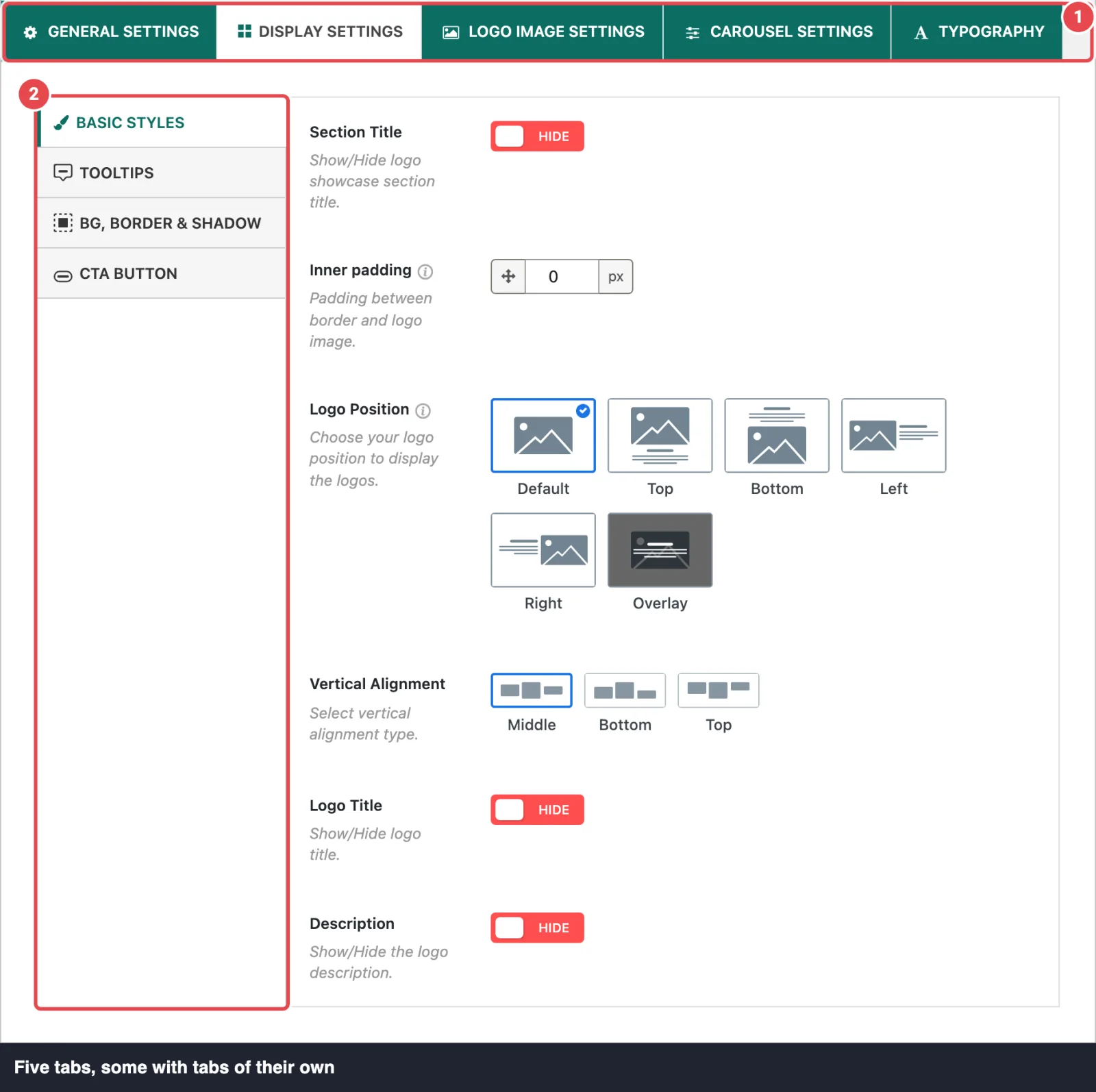
Display Settings
This tab has its own row of tabs.
Basic Styles
| Option | What it does | Default |
|---|---|---|
| Section Title | Shows the view's title as a heading above the logos. | Hide |
| Inner padding Pro | Space between each logo's border and its image. For Table, the cell padding. | 0px (Table: 15px) |
| Logo Position | Where the logo sits relative to its title and description: Default, or Pro Top, Bottom, Left, Right or Overlay. Shown for Carousel, Multi Rows, Grid, Masonry, Isotope and Inline. | Default |
| Overlay Content Type Pro | Overlay. Covered, Bottom or Top. | Covered |
| Overlay Background Color Pro | Overlay. The overlay's colour. | rgba(22,160,139,0.5) |
| Overlay Content Visibility Pro | Overlay. Always or On Hover. | Always |
| Vertical Alignment Pro | Middle, Bottom or Top, for logos of different heights. Carousel, Multi Rows, Grid and Masonry; not with Center style. | Middle |
| Logo Title Pro | Shows each logo's title. | Hide |
| Description Pro | Shows each logo's description. | Hide |
| Content Display Type Pro | Full description, or Limit it to a number of words. | Full |
| Words Limit Pro | Limit. How many words to show. | 30 |
| Read More Button Pro | Limit. Adds a read-more link after the shortened text. | Show |
| Read More Type Pro | Text Link or Button. | Text Link |
| Read More Button Label Pro | The link or button text. | Learn More |
| Read More Button Color Pro | Button. Color, Hover, Background, Hover BG, Border and Border Hover. | #05b3c6 / #ffffff / transparent / #05b3c6 / #05b3c6 / #05b3c6 |
| Read More Text Link Color Pro | Text Link. Color and Hover. | #555555 / #05b3c6 |
Tooltips Pro
A tooltip is a small label that pops up over a logo.
| Option | What it does | Default |
|---|---|---|
| Tooltip | Shows a tooltip on each logo. | Show |
| Position | Top, Bottom, Left or Right of the logo. | Top |
| Tooltip Max Width | Maximum width in px. | 220px |
| Speech Bubble Arrow | Shows the small arrow pointing at the logo. | Show |
| Distance | Gap between the logo and the tooltip, 1–500px. | 1px |
| Tooltip Content Source | Logo Title, Custom Tooltip Text (set per logo) or Description. | Logo Title |
| Tooltip Effect | Grow, Fade, Swing, Slide, Fall or None. | Grow |
| Tooltip Visibility | Mouseover or On Click. To use On Click, turn off the logo's link (set Click Action Type to Disabled). | Mouseover |
| Tooltip Color | Text Color and Background. | #ffffff / #000000 |
| Border & Arrow Color | Border width, style and colour, also used for the arrow. | 1px solid #000000 |
| Border Radius | Corner rounding. | 2px |
| Padding | Space inside the tooltip. | 6px 14px 6px 14px |
BG, Border & Shadow
Not shown for Table, which has Table Styles instead.
| Option | What it does | Default |
|---|---|---|
| Logo Background Type Pro | Solid, Gradient or None behind each logo. | None |
| Solid Color Pro | Solid. Background and Hover BG. | transparent / transparent |
| Gradient Color Pro | Gradient. Two colours and a direction. | #298679 → #40CC66, 135deg |
| Logo Border | Border width, style, colour and hover colour. | 1px solid #dddddd, hover #16a08b |
| Border Radius | Corner rounding, in px or %. | 0 |
| BoxShadow Pro | Inset, Outset or None. | None |
| Box-Shadow Values Pro | Vertical, horizontal, blur and spread. | 0 / 0 / 10 / 0 |
| BoxShadow Color Pro | Color and Hover Color. | rgba(0,0,0,0.3) / rgba(0,0,0,0.5) |
Ajax Pagination Pro
Shown for List, Inline, Grid, Masonry, Isotope and Table. Carousels page with arrows and dots instead.
| Option | What it does | Default |
|---|---|---|
| Pagination | Splits the logos into pages. | Disabled |
| Pagination Type | Ajax Number Pagination, Load More Button (Ajax), Infinite Scroll (Ajax) or No Ajax (Normal Pagination). | Load More Button (Ajax) |
| Logo(s) To Show Per Page | Logos on the first page. | 15 |
| Logo(s) To Show Per Click | Load More and Infinite Scroll. Logos added each time. | 5 |
| Load More Button Label | Load More. The button text. When there's nothing left, it reads "No more logos available". | Load More |
| Alignment | Left, centre or right. | Center |
| Margin | Space around the pagination. Not for Infinite Scroll. | 40 / 0 / 20 / 0 px |
| Color | Color, Hover Color, Background, Hover BG, Border, Hover Border. | #5e5e5e / #ffffff / transparent / #63a37b / #dddddd / #63a37b |
CTA Button Pro
A call-to-action button below the showcase, for example "Become a sponsor".
| Option | What it does | Default |
|---|---|---|
| Contact Us Button | Shows the button. | Hide |
| Button Style | Filled or Outline. | Filled |
| Border | Outline. Width, style, colour and hover colour. | 2px solid #444444, hover #16a08b |
| Color | Color, Hover, Background, BG Hover. | #ffffff / #ffffff / #13835a / #126344 |
| Border Radius | Button corner rounding. | 5px |
| Font Size | Text size in px. | 18px |
| Action Type | Link, Email (opens a mail app) or Phone (starts a call). | Link |
| Link URL | Link. Where the button goes, with an Open a New Tab box. | # |
| Email. The address. | — | |
| Phone Number | Phone. The number. | — |
| Text Label | The button text. | Contact Us |
Table Styles Pro
Shown only for the Table layout.
| Option | What it does | Default |
|---|---|---|
| Table Title Background Type | Solid or Gradient for the header row. | Solid |
| Solid Color | Solid. Header background. | #f3f5f7 |
| Gradient Color | Gradient. Two colours and a direction. | #298679 → #40CC66, 135deg |
| Table Title Color | Header text colour. | #50575e |
| Separator | Lines between rows. | 1px solid #cccccc |
| Background Color | Table background. | #ffffff |
| Border | Outer border and radius. | 1px solid #cccccc, radius 2 |
Logo Image Settings
| Option | What it does | Default |
|---|---|---|
| Logo Image | Shows the logo images. Turn off for a text-only showcase. | Show |
| Inner Padding Pro | Padding around the image, in px. | 10px |
| Logo Image Dimensions | Which image size to load: any registered WordPress size, Original uploaded image, or Set custom size. | Medium |
| Custom Logo Size | Custom size. Width, height and Soft-crop (fit the whole logo) or Hard-crop (cut to exact size). Suggested: 215 × 110px. Resized copies are made only when the original is at least that big. | Soft-crop |
| Load 2x Resolution Image in Retina Display Pro | Custom size. Serves a double-size image to high-density screens. The original must be at least twice the custom size. | Disabled |
| Variable Width Pro | Carousel, not Center. Each logo takes its natural width, so the number of visible logos depends on their widths. | Disabled |
| Height Pro | Variable Width on. Logo height per device, as a max-height (or other CSS height rule). | 700 / 600 / 500 / 400 / 300 px |
| Lazy Load | Loads images only as they come into view. See Performance. | Disabled |
| Hover Animation | An animation when visitors hover a logo, such as ZoomIn, Pulse, Swing or FadeIn (about 40 choices). Everything except None is Pro. | None |
| Blur Pro | Blurs the logo images. | Disabled |
| Blur Level Pro | Blur on. 1–5px. | 1px |
| Opacity Level | Logo image opacity, 0.01–1. | 1 |
| Logo Image Mode Pro | Original, Grayscale or Custom color. Custom color works only with PNG files. | Original |
| Grayscale on Hover Pro | Original mode. Turns logos grey on hover. | Off |
| Normal on Hover Pro | Grayscale mode. Restores colour on hover. | Off |
| Grayscale on Tablet & Mobile Pro | Grayscale + Normal on Hover. Keeps the grey effect on screens under 736px, where there's no hover. | Disabled |
| Logo Custom Color Pro | Custom color. Color and Hover. | #000000 / #999999 |
| Logo Title Attribute | Adds the logo's title as the image title attribute (a browser hover hint). | Off |
Carousel Settings
Shown only for Carousel and Multi Rows. It has four tabs.
Carousel Basics
| Option | What it does | Default |
|---|---|---|
| Carousel Orientation Pro | Horizontal or Vertical. Not with Ticker multi rows. | Horizontal |
| AutoPlay | Slides move on their own. Standard and Center styles. | Enabled |
| AutoPlay Delay Time | Pause between slides, in ms (1000 ms = 1 second). | 3000 |
| Carousel Speed | How long one slide takes, in ms. Standard and Center. | 600 |
| Carousel Speed Pro | Ticker. How long a full scroll takes, in ms. Higher is slower. | 10000 |
| Slide To Scroll Pro | How many logos move per slide, per device. | 1 |
| Pause on Hover | Stops the carousel while the pointer is over it. | Enabled |
| Carousel Starts on Screen | Starts autoplay only when the carousel scrolls into view. Not for Ticker. | Disabled |
| Infinite Loop | Loops back to the start instead of stopping at the end. Not for Ticker. | Enabled |
| Fade Effect Pro | Fades between slides instead of sliding. Horizontal Standard style only. | Disabled |
| Carousel Direction | Right to Left or Left to Right. | Right to Left |
Navigation
Shown for Standard and Center styles. A Ticker has no arrows.
| Option | What it does | Default |
|---|---|---|
| Navigation | Shows the arrows. | Show |
| Hide on Mobile | Hides the arrows on small screens. | Off |
| Position Pro | Top Right, Top Center, Top Left, Bottom Left, Bottom Center, Bottom Right, Vertical Inner, Vertical Outer or Vertical Center. | Top Right |
| Visible On Hover Pro | Vertical positions. Shows the arrows only while the pointer is over the carousel. | Off |
| Navigation Type Pro | Arrow icons or Text. | Arrow |
| Arrow Type Pro | One of eight arrow icon styles. | The first (angle) |
| Icon Size Pro | Arrow icon size in px. | 20px |
| Color | Color, Hover Color, Background, Hover Background. | #afafaf / #ffffff / transparent / #16a08b |
| Border | Width, style, colour and hover colour. | 1px solid #000000, hover #16a08b |
| Border Radius Pro | Arrow button rounding, in px or %. | 0 |
Pagination
The dots or numbers under a carousel. Standard and Center styles only.
| Option | What it does | Default |
|---|---|---|
| Pagination | Shows the pagination. | Show |
| Hide on Mobile | Hides it on small screens. | Off |
| Pagination Style | Bullets, or Pro Dynamic, Strokes, Scrollbar or Numbers. | Bullets |
| Color | Numbers. Color, Active Color, Background, Active BG. | #16a08b / #fff / #dddddd / #16a08b |
| Color | Other styles. Color and Active Color. | #dddddd / #16a08b |
Miscellaneous
| Option | What it does | Default |
|---|---|---|
| Adaptive Height | Adjusts the carousel's height to the visible logos. Carousel, Standard and Center. | Disabled |
| Tab & Key Navigation | Lets visitors move the carousel with the Tab and arrow keys. Carousel, Standard and Center. | Disabled |
| Touch Swipe | Swipe on touch screens. | Enabled |
| Mouse Draggable | Touch Swipe on. Drag with a mouse. | Enabled |
| Free Mode | Draggable on, not Ticker. Slides glide freely instead of snapping to a logo. | Disabled |
| Swipe To Slide | Draggable on, not Ticker. Lets a swipe land on any logo, regardless of Slide To Scroll. | Disabled |
Typography Pro
Each text element has a font group (family, weight, size, line height, alignment, transform, letter spacing and, where shown, colour) plus a Load … Font switch.
Turn on Google Fonts first
A font family only loads when both the element's Load … Font switch is on and Google Fonts is enabled in Dashboard → Settings → Advanced. Font weights depend on the family you pick.
| Option | Applies to | Default size / line height |
|---|---|---|
| Load Section Title Font / Section Title Font | The section title. Includes colour and bottom margin. | 24 / 32, left, #222 |
| Load Isotope Filter Category Font / Isotope Filter Category Font | Isotope filter buttons (Isotope only). | 14 / 20, centre |
| Load Logo Title Font / Logo Title Font | Logo titles, with colour and hover colour. | 14 / 21, centre, #2f2f2f |
| Load Logo Body/Description Font / Logo Body/Description Font | Logo descriptions. | 14 / 21, centre, #555 |
| Load Read More Font / Read More Font | The read-more link (when descriptions are limited). | 14 / 20, centre |
| Load Popup Title Font / Popup Title Font | The popup heading (when Logo Title is on). | 22 / 24, centre, #2f2f2f |
| Load Popup Description Font / Popup Description Font | The popup description (when descriptions are limited). | 14 / 23, centre, #555 |
All Load … Font switches are off by default, so the showcase uses your theme's fonts until you turn one on.
Related
- Manage Views: create, preview and place a view
- Manage Logos: the per-logo link and tooltip fields
- Dashboard → Settings: site-wide options for every view
- Free vs Pro