

Tutorial: A "Trusted by" Client Logo Carousel
Build the classic row of client logos under a hero section: calm, evenly spaced, readable on every screen, and quietly moving on its own.
A "Trusted by" strip has one job: show visitors, in two seconds, that real companies use you. It works when the logos look like a matched set and the motion is gentle enough not to compete with your headline. This tutorial builds one with the Carousel block and explains each choice along the way.
Time: about 15 minutes You'll use: Carousel · Logo Images · Layouts · Navigation Arrows · Pagination Dots
What you're building
A full-width row showing five logos on desktop, three on tablets and two on phones. It slides by itself every few seconds, pauses when someone points at it, and shows logos in grey that turn to full colour on hover.

Before you start
- Gather 8 to 15 logos. Fewer than the number of columns and there's nothing to slide; far more and nobody sees most of them.
- Make the files consistent. Transparent background, the mark trimmed close with a little even padding, roughly the same height-to-width proportions. SVG is ideal; a PNG about 400 px wide is plenty. This one step does more for the final look than any setting.
- Check you have permission to show each client's logo.
Step 1: Insert the block and add logos
- Edit the page and click + where the strip should go, just under your hero.
- Search for Carousel (it's in the Logo Carousel category) and insert it.
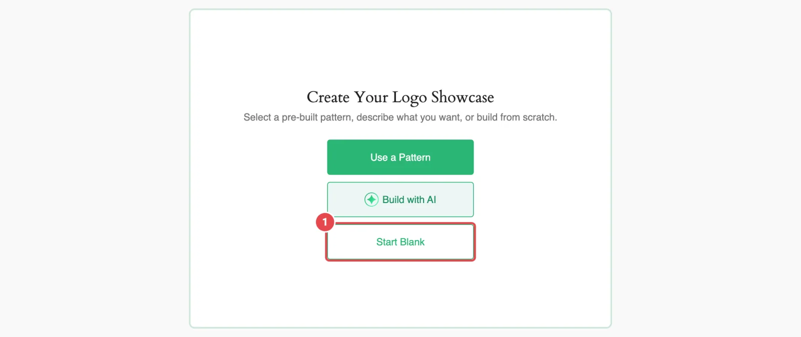
- The block opens on Create Your Logo Showcase. Click Start Blank.
- On Choose Logo Images, click Upload Logo Images to upload files from your computer, or Media Library to pick logos you've already uploaded. You can select several at once.
If you upload a file that's already in your Media Library, the plugin reuses the existing image instead of creating a duplicate, and tells you so.
Why not a pattern?
Use a Pattern gives you a styled starting point with demo logos you then replace. It's a fine shortcut, but building from blank once teaches you where every setting lives. See Ready Patterns for next time.
Step 2: Name each logo and write alt text
After choosing your images you land on Selected Logo Images.
- Drag the thumbnails into the order you want. Put your most recognisable clients first: they're the ones visible before the carousel moves.
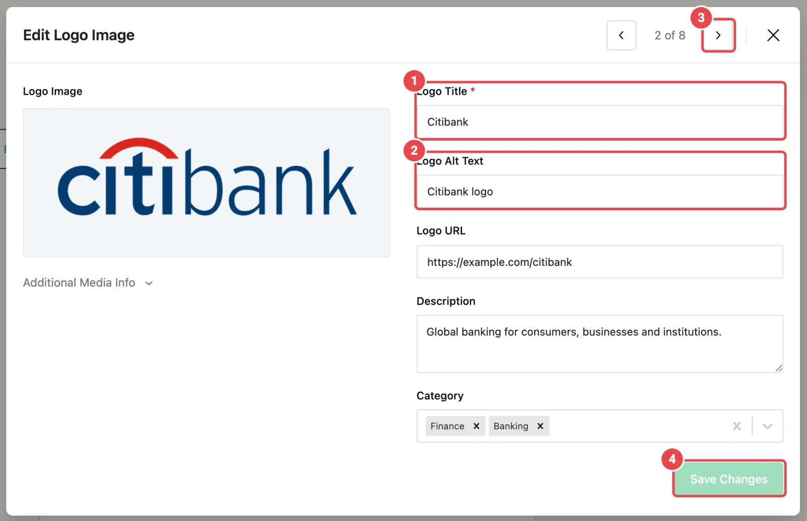
- Click the pencil on the first logo. The Edit Logo Image window opens.
- Check Logo Title (it defaults to the file name) and set it to the company's name.
- Fill in Logo Alt Text. The company name followed by "logo" is usually right: Northwind logo.
- Click Save Changes, then use the arrow at the top of the window (or the → key) to move to the next logo.
- When every logo is done, close the window and click Continue.
Why bother with alt text? A screen reader announces each logo. Without alt text it reads a file name, or nothing useful. Your title and alt text are also written back to the image in the Media Library, so you only do this once per logo. More in Accessibility.
Leave Logo URL empty for this build. A "Trusted by" strip is a credibility signal, not a set of exits from your page. (If you do want links, see Variations.)
Step 3: Choose the style and size
Select the block and open the Layouts panel in the right-hand sidebar (the inspector). Stay on its Settings tab.
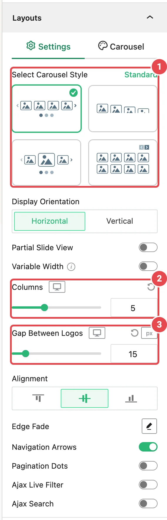
- Under Select Carousel Style, keep Standard. It's a straight row of equal logos: exactly what a trust strip needs. Center enlarges the middle logo, which suggests one client matters more than the rest.
- Set Columns. Use the device icons next to the control to set each screen size:
| Device | Columns | Why |
|---|---|---|
| Desktop | 5 | Enough to read as "lots of clients" while each logo stays big enough to recognise |
| Tablet | 3 | Five on a tablet shrinks logos until wordmarks blur |
| Mobile | 2 | Two side by side reads as a row; one at a time looks like a slideshow |
- Leave Gap Between Logos at 15 px, or raise it to 30–40 px if your logos are wide wordmarks that feel crowded.
- Leave Alignment on the middle option, so logos of different heights line up on their centres.
Optional: Edge Fade. Click the pencil next to Edge Fade and switch it on. The logos at each end fade into the background, which hints that the row continues and softens the hard edge. Leave Fade Color on Auto so it matches your section background. Pro
Step 4: Set the motion
Switch to the Carousel tab of the Layouts panel.
| Setting | Set it to | Why |
|---|---|---|
| Autoplay | On | Visitors rarely interact with a trust strip. Movement is what shows there are more logos. |
| Autoplay Delay | 3000–4000 ms | Long enough to register a logo, short enough to feel alive |
| Slider Speed | 600 ms (default) | A smooth glide; faster feels jumpy |
| Pause on Hover | On | Someone pointing at a logo is reading it. Don't slide it away. |
| Infinite Loop | On | The row never runs out or rewinds |
| Slide to Scroll | 1 | One logo at a time is calmer than a whole row jumping |
Leave Sliding Effects on Default and Carousel Direction as it is. Leave Tabs and Key Navigation on: it lets keyboard users move the carousel.
Autoplay and motion sensitivity
Autoplay that can't be paused is an accessibility problem. Pause on Hover covers mouse users, and keeping the arrows on (next step) gives everyone a way to control the row. For a page where motion matters less, turning Autoplay off and keeping the arrows is a perfectly good choice.
Step 5: Decide on arrows and dots
Back on the Layouts → Settings tab you'll find two switches: Navigation Arrows and Pagination Dots. Each one, when on, adds its own panel to the sidebar.
Navigation Arrows: keep them, but make them quiet. Open the Navigation Arrows panel:
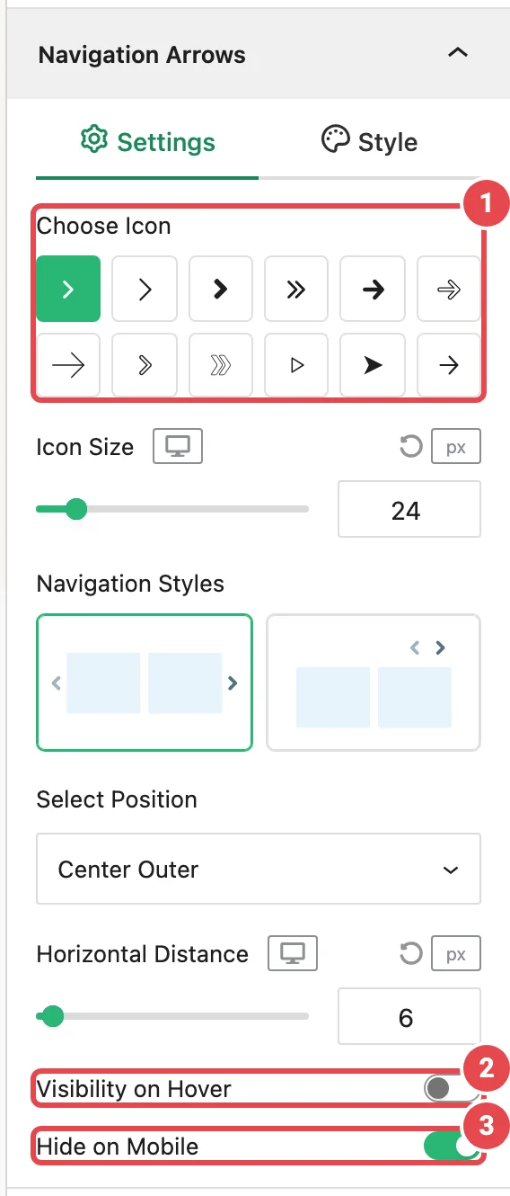
- Turn on Visibility on Hover, so the arrows appear only when someone points at the strip (they also appear for keyboard users). The row stays clean the rest of the time.
- Leave Hide on Mobile on. Phone users swipe, and arrows take space a two-logo row can't spare.
- Pick a simple icon under Choose Icon that matches your site.
Pagination Dots: usually turn them off. Dots tell people "you're on page 3 of 6", which matters in a slideshow and not in a trust strip. With logos looping forever, they're noise. Switch Pagination Dots off.
Step 6: Greyscale logos that colour on hover
ProClient logos come in every colour, and side by side they can look like a patchwork. Showing them in grey makes them read as one set; bringing back the colour on hover rewards curiosity.
There's no single "greyscale" switch. You build it from the image filter:
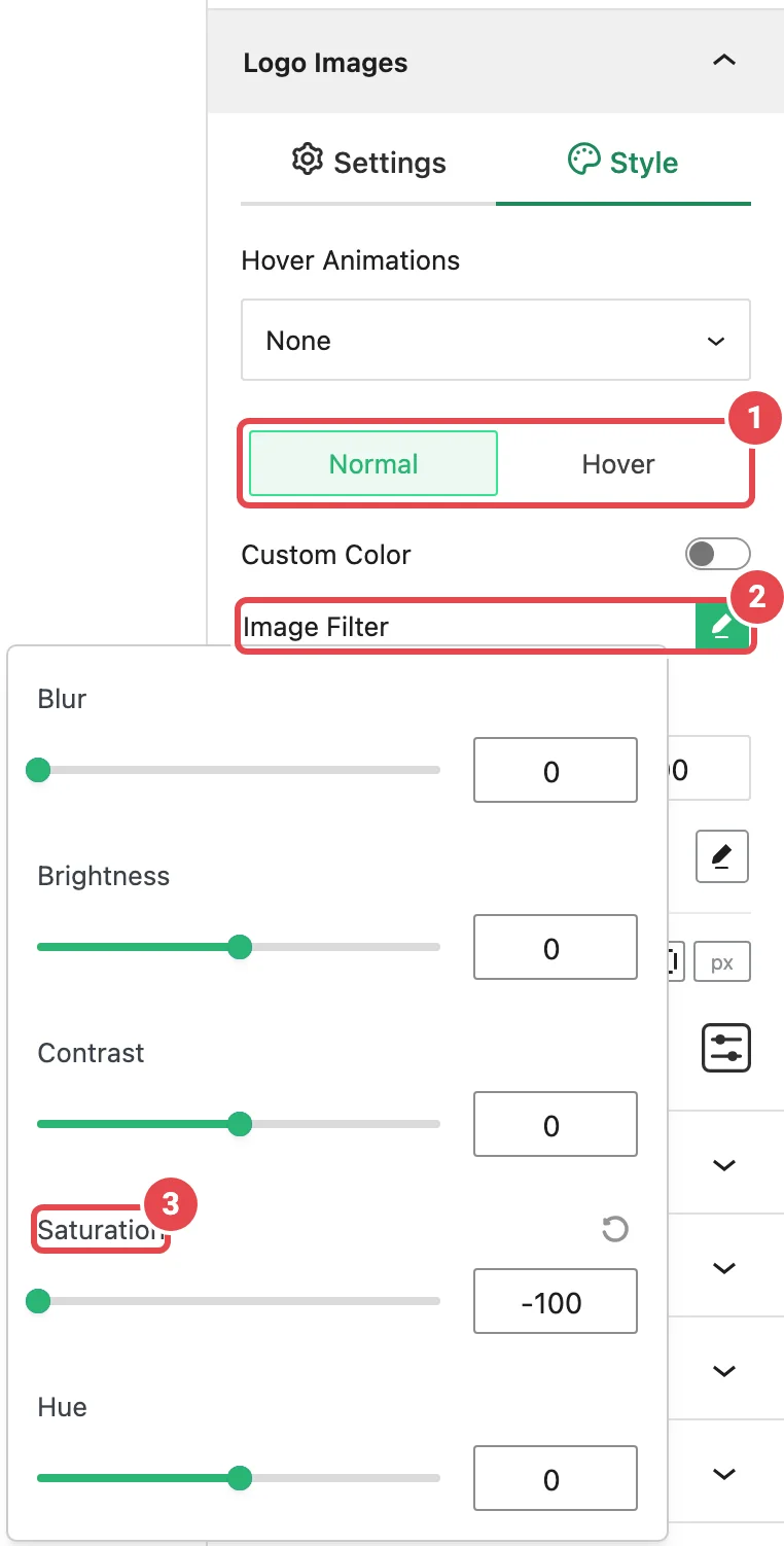
- Open the Logo Images panel and switch to its Style tab.
- Make sure the state switch shows Normal.
- Click the pencil next to Image Filter and drag Saturation all the way to -100. Every logo turns grey.
- Optional: set Image Opacity to about 70 so the grey logos sit back a little.
- Flip the state switch to Hover. Leave Image Filter at zero and Image Opacity at 100. On hover, the logo returns to full colour.
- Optional: under Hover Animations, choose Scale up for a small lift on hover.
The fade between the two states is built in. Phones don't hover, so mobile visitors see grey logos. That's fine: they still read clearly.
Step 7: Publish and check
Publish (or update) the page, then open it in a private window, logged out, the way a visitor sees it.
What done looks like:
- [ ] Five logos on a laptop, all the same visual weight, nothing cropped
- [ ] The row slides every few seconds and stops when you point at it
- [ ] Logos are grey and turn to colour on hover
- [ ] Arrows appear on hover and work
- [ ] On a real phone: two logos side by side, no arrows, swiping works, no sideways page scroll
- [ ] A screen reader (or your browser's accessibility inspector) reads each company name
If the carousel doesn't move or shows nothing at all for logged-out visitors, see Troubleshooting.
Variations
Link each logo to a case study
Add a Logo URL to each logo in Edit Logo Image, then in Logo Images → Settings set Click Actions to Logo URL. Pro Links open in a new tab.
Show company names under the logos
Open Display Elements and switch on Title. Pro Useful when some of your logos are symbols people won't recognise on their own.
Use the same strip on several pages
Don't copy the block. Save it once as a Saved Template and place [lc_template id="…"] wherever you need it. Update the template and every page follows.
A strip that never stops
If you'd rather have constant, slow movement than slide-by-slide steps, use the Marquee block instead. See A sponsor marquee for an event.
Common problems
| Symptom | Likely cause | Fix |
|---|---|---|
| Logos look different sizes | The image files have uneven padding | Trim the files consistently, or set Aspect Ratio in Logo Images → Settings so every logo gets the same box |
| Logos look blurry | Resolution is too small for the column width | Set Resolution to Large or Full |
| No arrows or dots on a phone | Hide on Mobile is on (the default) | Expected. Switch it off in that panel if you want them. |
| It doesn't slide | Autoplay is off, or there are no more logos than columns | Add logos or lower Columns |
| Every logo is grey, even on hover | The Hover state also has a filter | Switch the state to Hover and set Saturation back to 0 |
Related
- Carousel block: every panel in detail
- Adding Logos: uploading, editing and ordering
- Best Practices
- A sponsor marquee for an event