

Tooltips Pro
Show a logo's name, and optionally a short description, in a small bubble when a visitor hovers over or taps it.
A tooltip is the small label that pops up next to something you point at. On a logo showcase, it answers the visitor's first question, "whose logo is that?", without adding text under every logo and cluttering a clean design.
Tooltips are a good fit when your logos are small or unfamiliar, or when you want a minimal row of marks but still need names to be discoverable.
Pro feature
Tooltips are part of Logo Carousel Pro. The free edition shows the panel as a preview only. See Free vs Pro.
Which blocks support it
Every block has a Tooltips panel, with one exception on the Marquee:
| Block | Tooltips |
|---|---|
| Carousel | Yes |
| Grid | Yes |
| List | Yes |
| Marquee | Standard style, and Ribbon style in Single ribbon mode. Not available on Wave or Cross ribbon. |
| Table | Yes |
No module needs switching on. The panel is always there.
Turn tooltips on
- Select your Logo Carousel block.
- In the inspector, open the Tooltips panel.
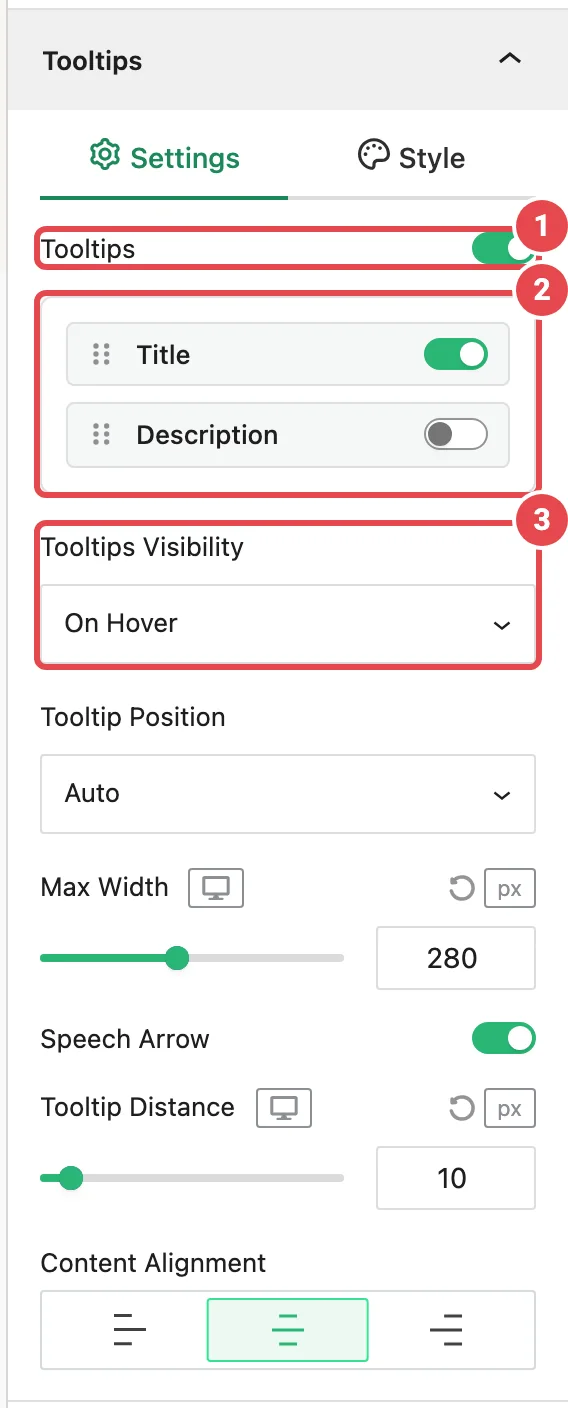
- On the Settings tab, switch on Tooltips.
- Hover a logo in the editor preview to see the result.
By default, a tooltip shows the logo's title, opens on hover, and places itself wherever it fits.
Fill in your logo titles and descriptions
A tooltip can only show what you've entered. The title comes from each logo's Title, and the description from its Description. Set both in the logo editor; see Edit a logo. A logo with no title shows no title in its tooltip.
Settings tab
| Option | What it does | Default |
|---|---|---|
| Tooltips | Turns tooltips on for every logo in the block. Every other option appears once this is on. | Off |
| Title / Description | Which pieces of text to show. Drag them to change the order. | Title on, Description off |
| Tooltips Visibility | On Hover or On Click. | On Hover |
| Tooltip Position | Auto, Top, Bottom, Left or Right. | Auto |
| Max Width | The widest a tooltip can get, 20–600 px. You can set a different value per device. | 280 px |
| Speech Arrow | The small pointer from the bubble to the logo. | On |
| Tooltip Distance | The gap between the logo and the bubble, 0–100 px. Per device. | 10 px |
| Content Alignment | Left, center or right text inside the bubble. | Center |
| Tooltip Summary Length | How many words of the description to show, 1–100. Only when Description is on. | 20 words |
| Ellipsis Points Ending Summary | The text added after a shortened description. Only when Description is on. | ... |
How Auto position works
With Auto, the tooltip tries the top of the logo first, then the bottom, then the right, then the left, and uses the first side where it fits on screen. If you pick a fixed side and there isn't room, the tooltip flips to the opposite side rather than being cut off.
Hover vs click
- On Hover opens the tooltip when the pointer (or keyboard focus) reaches a logo, and closes it shortly after it leaves.
- On Click opens it on click, or on Enter/Space for keyboard users. Click again, click elsewhere, or press Esc to close.
Phones and tablets can't hover, so touch devices always use click, whatever you choose here.
Clickable logos and click mode
If your logos also link somewhere or open a popup (see Logo Details Popup), stick with On Hover. In click mode the visitor's click has two jobs, and the link usually wins.
Style tab
The Style tab only works once tooltips are on. Until then it shows "Enable Tooltips in the Settings tab to style them."
| Option | What it does | Default |
|---|---|---|
| Tooltip Effect | How the bubble appears: None, Fade, Grow, Bounce, Slide In, Slide Up, Flip or Blur. | Fade |
| Tooltip Background | Solid color or gradient. With the Glassmorphism module on, a frosted-glass option too. | Dark gray (#2f2f2f) |
| Title Typography | Font, size and weight for the title. Shown when Title is on. | 16 px, regular |
| Description Typography | The same for the description. Shown when Description is on. | 14 px, regular |
| Title Text Color | White | |
| Description Text Color | Light gray (#d1d5db) | |
| Border | Style, width and color of the bubble's edge. | None |
| Border Radius | How rounded the corners are. | 4 px |
| Inner Padding | Space inside the bubble. | 7 px top and bottom, 14 px sides |
| Box Shadow | A drop shadow under the bubble. | Off |
What visitors experience
- A tooltip closes automatically when the carousel slides, so it never floats over the wrong logo.
- It repositions itself as the visitor scrolls or resizes the window.
- It works on right-to-left sites.
- Keyboard users can Tab to each logo to open its tooltip, and screen readers announce the tooltip text as the logo's description. See Accessibility.
Tips
- Keep it short. Title only is usually enough. If you add the description, lower Tooltip Summary Length to 10–15 words so the bubble stays readable.
- Match your design. On a light page, a dark bubble with white text (the default) reads well. On a dark section, try a light background with dark text.
- Don't double up. If you've turned on the title under each logo with Display Elements, a tooltip repeating the same title adds nothing. Use the tooltip for the description instead.
Troubleshooting
| Symptom | Likely cause | Fix |
|---|---|---|
| No Tooltips panel on a Marquee | The Marquee is on the Wave style or Cross ribbon mode. | Switch to Standard, or Ribbon in Single ribbon mode. |
| Tooltips are on but nothing appears | The logos have no title (and Description is off, or empty). | Add titles in the logo editor. See Edit a logo. |
The description is cut off with ... | Tooltip Summary Length is shorter than the description. | Raise it, or shorten the description. |
| The tooltip opens on the "wrong" side | Auto picked the first side with room, or a fixed side flipped because it didn't fit. | That's by design. Give the block more space around it, or choose a different fixed side. |
| Tooltips open on tap even though I chose On Hover | The visitor is on a touch device. | Expected: touch screens can't hover. |
| The frosted-glass background option is missing | The Glassmorphism module is off. | Turn it on in Modules. |
Related
- Carousel → Tooltips panel
- Logo Details Popup: show the full details on click
- Edit a logo: where titles and descriptions come from
- Accessibility