

Carousel
Show your logos in a sliding carousel with autoplay, arrows, dots, and four carousel styles.

The Carousel block (a ready-made element you drop into the WordPress editor) shows a row of logos that slides on its own or when visitors click, swipe, or use the keyboard. It's the classic "trusted by" strip: client logos, sponsors, partners, or the brands you stock.
This page is also the complete inspector reference. Grid, List, Marquee, and Table share most of the Carousel's panels, so those panels are documented here in full, and the other block pages link back instead of repeating them.
How to add the Carousel block
- Open the page or post you want the carousel on (Pages → Add New, or edit an existing one).
- Click the + (Add Block) button in the editor toolbar.
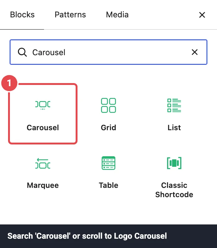
- Search for Carousel, or scroll to the Logo Carousel category.
- Click Carousel to insert it.
The block lands at wide alignment, so it stretches a little past your text column. You can change that from the block toolbar like any other block.
Don't see the block?
Each block can be switched off site-wide in Dashboard → Blocks. A switched-off block doesn't appear in the inserter at all. See Troubleshooting if it's still missing.
The start screen
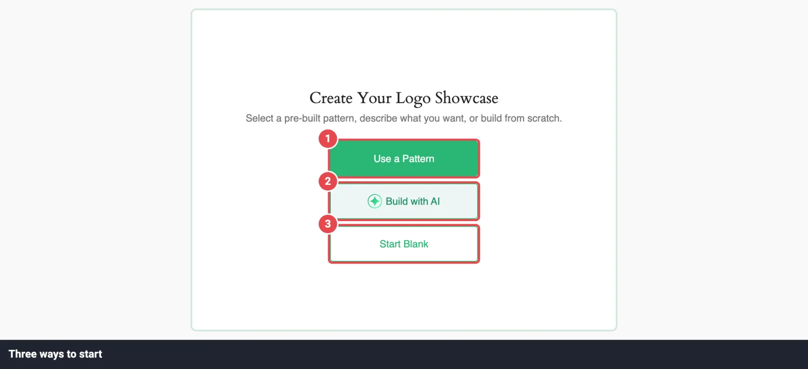
A brand-new Carousel doesn't have any logos yet, so the canvas shows a start screen titled Create Your Logo Showcase with up to three buttons:
| Button | What it does |
|---|---|
| Use a Pattern | Opens the Ready Patterns Library, where you can pick a finished design and swap in your own logos later. See Ready Patterns. |
| Build with AI | Opens the AI builder. Describe the showcase you want in a sentence and it sets the layout, motion, and styling for you. See AI Builder. |
| Start Blank | Takes you to Choose Logo Images, where you upload logos or pick them from your Media Library. |
If the Ready Patterns or Build with AI module is switched off in Dashboard → Modules, its button disappears from this screen.
Starting blank
- Click Start Blank.
- On Choose Logo Images, click Upload Logo Images to upload files from your computer, or Media Library to pick images you've already uploaded. You can select several at once.
- On Selected Logo Images, drag the thumbnails into the order you want. Click the pencil on any logo to give it a title, alt text, link, description, or categories.
- Click Continue. The live carousel appears on the canvas and the settings sidebar opens on the right.
Logos can be PNG, JPG, GIF, or WebP. SVG works too when an administrator allows it (see Allow SVG Uploads under Logo Images). Uploading a file that's already in your Media Library reuses the existing image instead of creating a duplicate.
The full walkthrough, including every field in the Edit Logo Image window, lives on Adding Logos.
Expected result
Once you click Continue, the logos start sliding on the canvas straight away. Autoplay is on by default, so you'll see the carousel move in the editor too. Every change you make in the sidebar updates the preview instantly.
The editor toolbar
Once the block has logos, its floating block toolbar gets three extra buttons:
| Button | What it does |
|---|---|
| Edit Logos | Opens Selected Logo Images so you can reorder, edit, or delete logos. If the block still has demo logos from a pattern or the AI builder, this opens the Media Library instead, and the logos you pick replace the whole demo set. |
| Add Logos | Opens the Media Library straight away. Logos already in the block are pre-ticked; anything new you tick is added to the end. |
| Refine with AI | Reopens the AI builder in refine mode, so you can ask for changes ("make the logos grayscale, 6 per row, slower autoplay"). Only shown when the AI builder is available. |
The editor's top bar also has Patterns Library and Build with AI buttons. They open the same windows as the start screen.

"This block uses demo logo images"
A block built from a pattern or by the AI builder starts with sample logos, and a note below it reminds you to replace them. Use Edit Logos to swap in your own. The note goes away as soon as you change the logos.
Finding your way around the inspector
The inspector is the settings sidebar on the right that opens whenever the block is selected. It's a stack of collapsible panels, and only one panel is open at a time. Logo Images opens first. Most panels have a Settings tab and a Style tab.
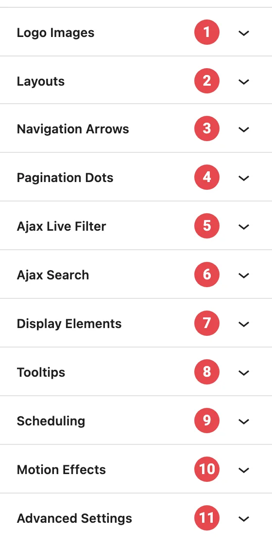
Here's what lives where, in sidebar order:
| Panel | What it controls | When it shows |
|---|---|---|
| Logo Images | Your logo list, image size and shape, click behaviour, lazy loading, and image styling. | Always |
| Layouts | Carousel style, columns, gaps, edge fade, and the movement settings (autoplay, speed, loop…). | Always |
| Navigation Arrows | Arrow icon, position, size, and colours. | When Navigation Arrows is on in Layouts (it is by default) |
| Pagination Dots | Dot style, size, and colours. | When Pagination Dots is on in Layouts (it is by default) |
| Ajax Live Filter | Category filter above the carousel. | When Ajax Live Filter is on in Layouts |
| Ajax Search | Search box above the carousel. | When Ajax Search is on in Layouts |
| Display Elements | Titles, descriptions, Read More, and the card around each logo. | Always |
| Tooltips | A small label that appears on hover or click. | Always |
| Scheduling | Show the block only between two dates. | When the Scheduling module is on |
| Motion Effects | Entrance animation, scroll parallax, and sticky position. | When the Motion Effects module is on |
| Advanced Settings | Block background, spacing, per-device hiding, and custom CSS class/ID. | Always |
Per-device settings
Some controls show a small monitor icon next to their label. Click it to switch between Desktop, Tablet, and Mobile and set a different value for each. Switching device also switches the editor preview, so you see the result right away. Tablet means screens 900px wide or narrower, and Mobile means 600px or narrower. (See breakpoint in the glossary.)
Using the free version?
Controls marked Pro on this page need Logo Carousel Pro. In the free version they show as locked previews. If you open a block that was built with Pro, its Pro settings are kept, so they come back if you upgrade. See Free vs Pro.
Logo Images
This is where you manage the logos themselves and decide how each image is sized, loaded, and styled. It has two tabs: Settings and Style.
If the block has no logos yet, the panel just says Add logos to enable style options. Click Add logos to open the Media Library.
Managing logos in the sidebar
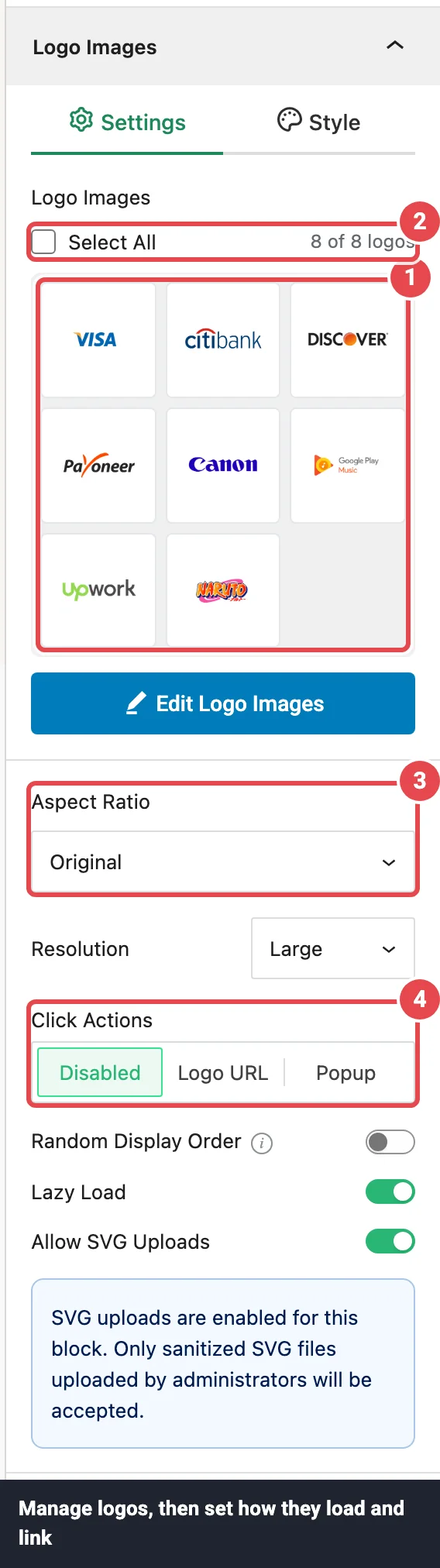
At the top of the Settings tab is a compact logo manager:
- Drag a thumbnail to reorder logos. The keyboard works too.
- Click the pencil on a thumbnail to edit that logo's title, alt text, URL, description, and categories, or the trash icon to remove it.
- Tick several logos (or use Select All) to act on them together. A bar appears with Category (add the selected logos to one or more categories) and Delete.
- The manager shows 12 logos at first. Click See More to load the next 12.
- Edit Logo Images at the bottom opens the bigger Selected Logo Images screen on the canvas.
Deleting a logo only removes it from this block. The image stays in your Media Library. Categories are what the Ajax Live Filter filters by. More on all of this in Adding Logos.
Large collections
At 100 logos the editor starts loading the list in batches so it stays responsive. At 250 you'll see a warning, and 500 is the maximum for one block. If you're getting close, split the logos across two carousels.
Settings tab
| Option | What it does | Default |
|---|---|---|
| Aspect Ratio | The shape of the box each logo sits in: Original (each logo keeps its own shape), Square 1:1, Standard 4:3, Portrait 3:4, Classic 3:2, Classic Portrait 2:3, Wide 16:9, Tall 9:16, or Custom. Logos are never cropped; they're scaled to fit inside the box. | Original |
| Width / Height | (Custom only) The size of the logo box, per device, in px, %, or em. Height also accepts auto. | Width 100%, Height auto |
| Resolution | Which WordPress image size loads on the page: Full, Large, Medium, or Thumbnail. Smaller sizes load faster. Logos are rarely displayed big, so Medium is often plenty. | Large |
| Click Actions Pro | What happens when someone clicks a logo image. Disabled: nothing. Logo URL: opens the logo's link in a new tab (logos without a URL aren't clickable). Popup: opens a details window for that logo (see Logo Details Popup). | Disabled |
| Random Display Order Pro | Shuffles the logos every time the page loads, so no brand is always first. It still shuffles on cached pages. | Off |
| Lazy Load | Waits to load logos that start off-screen. The first visible logos always load straight away. | On |
| Allow SVG Uploads | Lets administrators upload SVG logos to this block. Uploaded SVGs are cleaned of scripts before they're saved. Only administrators see this switch. | On |
Style tab
The Style tab has a Normal / Hover switch near the top. Settings below it apply to whichever state is selected, so you can, for example, show logos in gray and bring the colour back on hover.
| Option | What it does | Default |
|---|---|---|
| Hover Animations Pro | A movement played when the pointer is over a logo: Scale up, Fade + scale, Rotate, Slide up, Skew (move and hold); Bounce, Shake, Jelly, Swing, Wobble, Spin 360, Flip X, Flip Y (play once); Float, Pulse, Heartbeat (repeat while hovered); or Border ring (draws a ring around the logo). | None |
| Custom Color Pro | Recolours each logo to a single flat colour that you pick, which is handy for a uniform one-colour logo wall. Works best on transparent PNG and SVG logos. If you set a colour for Normal but not Hover, Hover uses the Normal colour. | Off |
| Image Filter Pro | Five sliders: Blur (0–20), Brightness, Contrast, Saturation (each −100 to 100), and Hue (−180 to 180). Set Saturation to −100 for grayscale logos. | All 0 |
| Image Opacity | How see-through the logos are, from 0 to 100. | 100 |
| Overlay Pro | A solid or gradient colour layer on top of each logo, with its own Overlay Opacity (0–1). | Black, opacity 0 (invisible) |
| Margin | Space around each logo inside its slot. This one setting is shared by Normal and Hover. | 0 |
Gray logos that light up on hover
Select Normal, open Image Filter, and set Saturation to −100. Then select Hover and leave its filters at 0. Each logo now turns back to full colour when the pointer is over it.
Layouts
The Layouts panel sets the carousel's shape and how it moves. It has two tabs: Settings for the layout, and Carousel for autoplay and motion.
Carousel styles in plain English
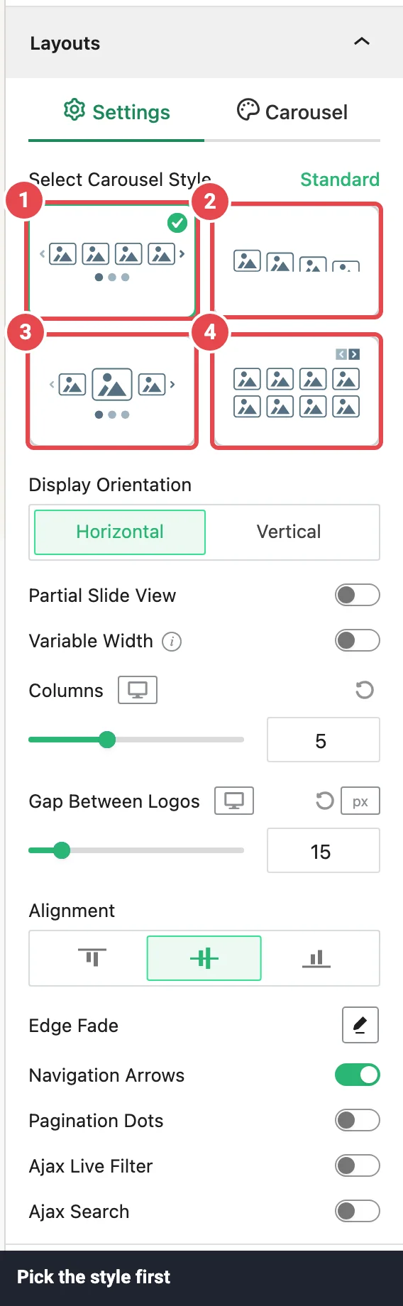
Select Carousel Style at the top of the Settings tab is the big choice. The four styles are shown as picture cards; hover over a card to see its name.
| Style | What it looks like |
|---|---|
| Standard | Equal-width logos side by side, sliding along as one row. The safe default for most sites. |
| Center | The logo in the middle is shown bigger and the logos around it fade back, like a spotlight on the current brand. |
| Multi Columns Pro | Two or more rows of logos that slide together, so you can show more brands in the same width. |
| Staggered Pro | Instead of sliding, the whole set of visible logos is swapped out for the next set with an animation, one logo just after another. It looks lively without moving sideways. |
A few things change when you switch styles:
- Each style remembers its own columns, direction, slide count, and effect. If you switch from Standard to Center and back, your Standard settings are still there.
- Switching to Staggered turns Navigation Arrows and Pagination Dots off. Switching to any other style turns them back on.
- Staggered hides the controls that don't apply to it, including Display Orientation, Partial Slide View, Variable Width, the Ajax filter and search, and most of the Carousel tab.
Settings tab
| Option | What it does | Default |
|---|---|---|
| Select Carousel Style | Standard, Center, Multi Columns, or Staggered (see above). | Standard |
| Display Orientation Pro | Horizontal (logos slide sideways) or Vertical (logos slide up or down). Not shown for Staggered. | Horizontal |
| Center Emphasis | (Center only) How much bigger the middle logo is, from 1 (same size) to 2 (double). | 1.2 |
| Slide Logos Opacity | (Center only) How faded the side logos are, from 0 (invisible) to 1 (no fade). | 0.5 |
| Partial Slide View Pro | Shows a sliver of the next logo at the edge, which hints that there's more to swipe. Not shown for Staggered. | Off |
| Variable Width Pro | Lets each logo keep its natural width instead of forcing equal slots. Good for logos of very different shapes. Not shown for Staggered, and it has no effect on Vertical or Multi Columns carousels. While it's on, the number of logos per view comes from their widths rather than Columns. | Off |
| Columns | How many logos are visible at once, per device (1–12). Becomes Rows when the orientation is Vertical. | 5 / 2 / 1 (Rows: 5 / 4 / 3) |
| Carousel Rows / Columns | (Multi Columns only) How many rows and columns make up the visible grid, per device. In a vertical carousel these become Carousel Columns and Rows. | Rows 2 / 2 / 2, Columns 5 / 3 / 2 |
| Gap Between Logos | Space between logos, per device (px, %, or em). | 15px |
| Alignment | How logos of different heights line up: top, center, or bottom in a horizontal carousel; left, center, or right in a vertical one. | Center |
| Edge Fade Pro | Click the pencil to open the fade settings. Fades the carousel's edges into the background so logos seem to drift in and out. Inside: Edge Fade (on/off), Fade Strength (0–100, default 80), Fade Width (0–100, default 50), and Fade Color: Auto picks up the colour behind the carousel, Custom lets you Select Color. | Off |
| Navigation Arrows | Shows previous/next arrows and the Navigation Arrows panel. | On |
| Pagination Dots | Shows dots under the carousel and the Pagination Dots panel. | On |
| Ajax Live Filter Pro | Adds a category filter above the carousel and the Ajax Live Filter panel. Not shown for Staggered. | Off |
| Ajax Search Pro | Adds a search box above the carousel and the Ajax Search panel. Not shown for Staggered. | Off |
| Filter & Search Orientation | (Both filter and search on) Inline puts them side by side; Stacked puts one above the other. | Inline |
| Filter & Search Gap | (Both on) Space between the filter and the search box, per device. | 15px |
| Justify Filter & Search | (Both on, Inline) How the pair is spread across the row: Flex Start, Center, Flex End, Space Between, Space Around, or Space Evenly. | Flex Start |
Carousel tab
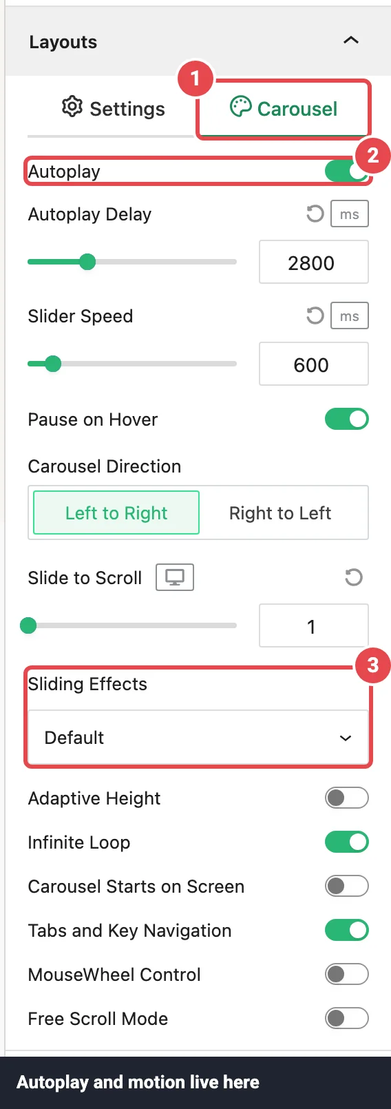
This tab controls autoplay and exactly how the carousel moves. The options depend on the style.
Standard, Center, and Multi Columns
| Option | What it does | Default |
|---|---|---|
| Autoplay | Moves the carousel on its own. Autoplay keeps going after a visitor clicks or drags. | On |
| Autoplay Delay | (Autoplay on) How long the carousel waits before moving again, in milliseconds. 3000 ms is 3 seconds. | 3000 ms |
| Slider Speed | How long each move takes, in milliseconds. Lower is snappier. | 600 ms |
| Pause on Hover | (Autoplay on) Stops autoplay while the pointer is over the carousel, so visitors can take a look. | On |
| Carousel Direction | Which way the carousel runs. Horizontal: Left to Right or Right to Left (right-to-left mode, which suits RTL languages). Vertical: Bottom to Top or Top to Bottom. | Left to Right |
| Slide to Scroll Pro | How many logos move per step, per device (1–12). | 1 |
| Sliding Effects Pro | The feel of each move: Default, Slide, Ease-in-out slide, Spring bounce (a slight overshoot), Snappy, Fade, or Slide + fade. | Default |
| Adaptive Height | Resizes the carousel to fit the tallest visible logo. Only applies to horizontal carousels. | Off |
| Infinite Loop | After the last logo, carries on from the first instead of stopping. Multi Columns carousels don't loop, even with this on. With Fade or Slide + fade, the carousel jumps back to the start instead of looping. | On |
| Carousel Starts on Screen | Waits to start the carousel until it's about to scroll into view. Useful for carousels further down a long page. | Off |
| Tabs and Key Navigation | Lets visitors move the carousel with the keyboard arrow keys while it's on screen. | On |
| MouseWheel Control | Lets visitors move the carousel with the mouse wheel or trackpad. | Off |
| Free Scroll Mode | Lets visitors drag the carousel freely instead of it snapping to the next logo. | Off |
Staggered Pro
| Option | What it does | Default |
|---|---|---|
| Staggered Animations | How each new logo arrives: Slide to Top, Slide to Bottom, Slide to Right, Slide to Left, Random Slide, Alternating Direction, Fade In, Blur Reveal, Crossfade Scale, Flip Curtain, or Bounce In. | Slide to Bottom |
| Easing | The rhythm of the animation: Default, Linear, Ease In, Ease Out, Ease In & Out, Ease In Back, Ease Out Back, or Ease In & Out Back (the "Back" options overshoot slightly). | Default |
| Random Logo Animation | Animates the logos in a random order instead of one after another. | Off |
| Autoplay | Swaps the logo set on its own. | On |
| Staggered Delay | (Autoplay on) How long each set stays before the next one arrives, in milliseconds. | 3000 |
| Speed | (Autoplay on) How long each logo's entrance animation takes, in milliseconds. | 600 |
| Pause on Hover | (Autoplay on) Holds the current set while the pointer is over it. | On |
| Adaptive Height | Same as above. | Off |
| Infinite Loop | Same as above. | On |
Reduced motion
If a visitor's device asks for reduced motion, a Staggered carousel still changes sets but skips the entrance animation.
Navigation Arrows
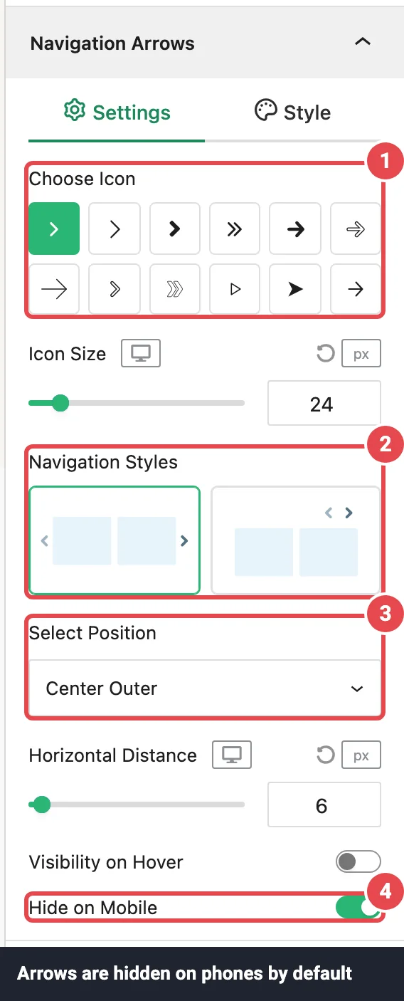
Shown while Navigation Arrows is on in Layouts. To remove the arrows, switch that toggle off. There's no separate on/off switch inside this panel.
Settings tab
| Option | What it does | Default |
|---|---|---|
| Choose Icon | Pick one of 12 arrow icons. | Arrow 1 |
| Icon Size | Arrow size in px, per device (8–120). | 24 / 22 / 20 |
| Navigation Styles | Arrows on sides (one arrow at each end of the carousel) or Arrows top-right (both arrows together in a corner). Switching style resets Select Position to that style's default. | Arrows on sides |
| Select Position | Where the arrows sit. Arrows on sides: Center, Center Outer (just outside the logos), or Center Inner (over the logos). Arrows top-right: Top Left, Top Center, Top Right, Bottom Left, Bottom Center, or Bottom Right. | Center Outer (Top Right for the second style) |
| Horizontal Distance | (Arrows on sides, Center Outer) How far the arrows sit from the logos. | 6px |
| Gap Between Arrows | (Arrows top-right) Space between the two arrows. | 10px |
| Visibility on Hover | Hides the arrows until the visitor hovers over the carousel (or tabs to it with the keyboard). | Off |
| Hide on Mobile | Hides the arrows on screens 600px wide or narrower, where visitors swipe instead. | On |
Arrows missing on your phone?
That's Hide on Mobile, which is on by default. Turn it off here if you want arrows on small screens too.
Style tab
Use the Normal / Hover switch to style each state separately.
| Option | What it does | Default |
|---|---|---|
| Background | Transparent, solid colour, or gradient behind each arrow. | None |
| Icon Color / Icon Color (Hover) | The arrow colour. | #1e1e1e / #2ab674 (green) |
| Border | Style, width, and colour of the arrow button's outline. | None |
| Border Radius | Rounds the arrow button's corners. | 4px |
| Inner Padding | Space between the icon and the button edge. Raise it to make a bigger clickable button. | 0 |
| Margin | (Arrows top-right) Space around the arrow pair. | 0 |
Pagination Dots
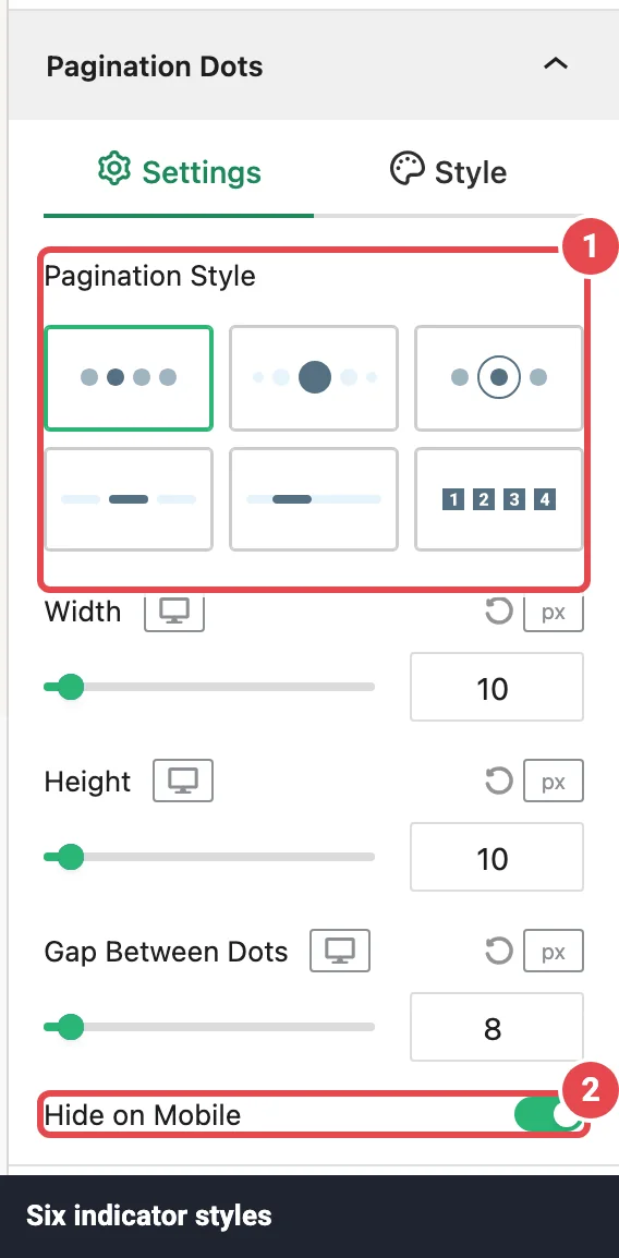
Shown while Pagination Dots is on in Layouts. As with the arrows, you switch them off in Layouts.
Settings tab
| Option | What it does | Default |
|---|---|---|
| Pagination Style | Dots, Dynamic (the active dot is bigger and the ones around it shrink), Ring, Dash (short bars), Scrollbar (a draggable bar), or Numbers (numbered buttons). Picking a style resets Width and Height to sizes that suit it. | Dots |
| Width | Width of each dot, per device. Not shown for Scrollbar. | 10px |
| Height | Height of each dot (or the scrollbar), per device. | 10px |
| Gap Between Dots | Space between dots, per device. Not shown for Scrollbar. | 8px |
| Hide on Mobile | Hides the dots on screens 600px wide or narrower. | On |
Style tab
Use the Normal / Active switch to style the inactive dots and the current one separately.
| Option | What it does | Default |
|---|---|---|
| Typography | (Numbers only) Font settings for the numbers. | 11px, weight 600 |
| Text Color | (Numbers only) Number colour. | White |
| Color | Dot colour. Called Background Color for Numbers, and Track Color / Thumb Color for Scrollbar. | #9fb3bf, active #557182 |
| Border / Border Radius | (Numbers only) Outline and rounding of the number buttons. | None / 3px |
| Margin | Space around the whole row of dots. | 24px top, 16px bottom |
Ajax Live Filter Pro
Adds a row of category buttons (or a dropdown) above the carousel. When a visitor picks a category, the carousel rebuilds itself with only the matching logos. It filters by the categories you give each logo in the Edit Logo Image window, and everything happens in the browser, so it's instant.
Turn it on with Ajax Live Filter in Layouts. Choose a Minimal, Button, or Dropdown look, and whether to show an All option and a count next to each category. Every option is on the Ajax Live Filter page.
Ajax Search Pro
Adds a search box above the carousel. As visitors type, the carousel narrows to logos whose title, category, or alt text matches. It works together with the filter, so a visitor can pick a category and then search within it.
Turn it on with Ajax Search in Layouts. You can pick one of three search bar styles and set the placeholder and the No Results Text. Full details are on Ajax Search.
Display Elements Pro
By default the carousel shows logos only. Display Elements adds text under or above each logo (a title, a description, a Read More button) and lets you style the card around it. It has Settings and Style tabs.
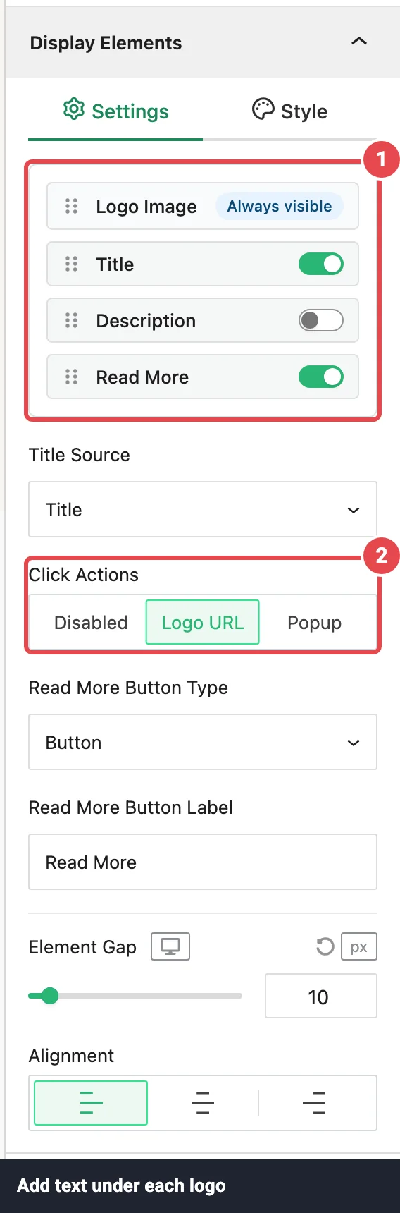
Settings tab
| Option | What it does | Default |
|---|---|---|
| Element list | Logo Image, Title, Description, and Read More. Switch each text element on or off and drag to change the order. Logo Image is always shown and can only go first or last. | Title, Description, and Read More all off |
| Title Source | (Title on) Use the logo's Title or its Caption. | Title |
| Description Source | (Description on) Use the Logo Description or the Caption. | Logo Description |
| Description Word Limit | (Description on) Full or Limit. | Full |
| Length | (Limit) How many words to keep (1–100). | 10 |
| Ellipsis Points Ending Excerpt | (Limit) What's added after a shortened description. | ... |
| Click Actions | What the title and Read More do when clicked. Disabled, Logo URL (opens the logo's link in a new tab), or Popup (opens the Logo Details Popup). Turning on Read More while this is Disabled switches it to Logo URL for you. | Disabled |
| Read More Button Type | (Read More on, Click Actions not Disabled) Button or Text (Inline). Inline sits at the end of the description, so it only works while Description is on; otherwise it shows as a button. | Button |
| Read More Button Label | The button text. | Read More |
| Element Gap | Space between the logo and each text element, per device. | 10px |
| Alignment | Left, Center, or Right text alignment. | Left |
Two ways to open the popup
The Click Actions here makes the title and Read More clickable. The separate Click Actions in Logo Images makes the logo image clickable. Set either one (or both) to Popup to open the Logo Details Popup, which shows the logo bigger with its title, categories, description, and a Visit Link button.
Style tab
| Option | What it does | Default |
|---|---|---|
| Title Typography | Font settings for titles. Leave the font empty to use your theme's font. | 18px, weight 600 |
| Description Typography | Font settings for descriptions. | 14px, weight 400 |
| Read More Style | Click the pencil to style the Read More text, background, border, rounding, padding, and margin (Normal and Hover). | Dark button, white text |
| Title Text Color / Description Text Color | Text colours, with a Normal / Hover switch. | #000000 / #757575 |
| Card Background Type | Solid colour or gradient behind each logo card (Normal and Hover). A frosted-glass option appears when the Glassmorphism module is on, with six presets such as Clear Glass and Light Frost. | Transparent |
| Border | The card outline (Normal and Hover). | 1px solid #dddddd |
| Border Radius | Rounds the card corners, per device. | 4px |
| Inner Padding | Space inside the card, per device. | 16px |
Tooltips Pro
A tooltip is a small label that pops up next to a logo, showing its title (and optionally its description) when visitors hover over or tap it. Switch on Tooltips in this panel's Settings tab, then choose:
- On Hover or On Click under Tooltips Visibility. Phones and tablets always use tap.
- The Tooltip Position (Auto finds the side with room), Max Width, Speech Arrow, and Tooltip Distance.
- In the Style tab, an entrance Tooltip Effect (default Fade), background, text colours, and border.
Tooltips work with the keyboard too, and Esc closes them. Every option, with defaults, is on Tooltips.
Scheduling Pro
Shows the block only between two dates, which is useful for an event's sponsor carousel or a seasonal promotion. Switch on Scheduling, then set a Start Date & Time, an End Date & Time, or both. Leave one empty for an open-ended window.
- Times use your site's timezone (Settings → General in WordPress).
- Scheduling only affects the live site. The block always stays visible in the editor so you can keep working on it.
- While scheduling is on, that page isn't cached. Otherwise, a cached copy could keep showing (or hiding) the carousel after the window changes.
This panel only appears while the Scheduling module is on in Dashboard → Modules. Full details: Scheduling.
Motion Effects Pro
Animates the whole block as visitors scroll. That's different from Hover Animations in Logo Images, which move single logos on hover. The panel has three rows:
- Scroll: a gentle parallax that shifts the block up or down as the page scrolls. Set the Direction, Speed (1–10), and the View Port band where it happens.
- Sticky: pins the block to the Top or Bottom of the screen while its section scrolls past.
- Entrance Animation: plays once when the block comes into view. Choose from 41 effects in groups such as Fading, Zooming, Bouncing, and Sliding, then set the Animation Speed and Animation Delay. In a carousel, the logos visible at that moment animate in one after another.
Visitors whose device asks for reduced motion don't see these effects. This panel only appears while the Motion Effects module is on in Dashboard → Modules. All effects and recipes are on Motion Effects.
Advanced Settings
Block-level settings that every Logo Carousel block shares. Three tabs: General, Visibility, and Advanced.
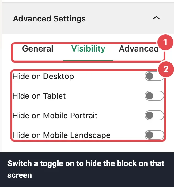
General tab
| Option | What it does | Default |
|---|---|---|
| Section BG Type | Transparent, solid colour, or gradient behind the whole block. | Transparent |
| Padding | Space inside the block, around the carousel, per device. | 0 |
| Margin | Space between this block and the blocks above and below it, per device. | 0 |
Visibility tab
| Option | What it does | Default |
|---|---|---|
| Hide on Desktop | Hides the block on screens wider than 900px. | Off |
| Hide on Tablet | Hides the block on screens 601–900px wide. | Off |
| Hide on Mobile Portrait | Hides the block on phones held upright (600px or narrower). | Off |
| Hide on Mobile Landscape | Hides the block on phones turned sideways. | Off |
Switching one of these on hides the block on that screen. In the editor the block stays visible but looks faded and striped, so you can still select and edit it.
Hidden isn't the same as not loaded
A block hidden on mobile is still part of the page. It's hidden with CSS, so phones still download it. If you want faster pages, lower the logo Resolution in Logo Images instead. See Performance.
Advanced tab
| Option | What it does | Default |
|---|---|---|
| Additional CSS Class(es) | One or more class names (separated by spaces) added to the block, so you can target this carousel from your own stylesheet. | Empty |
| Additional CSS ID | An ID for the same purpose. It goes on a wrapper around the block. | Empty |
Where to put the CSS
Give the block a class here, then write your rules against that class in the site-wide Custom CSS box. Targeting the plugin's own internal class names works too, but those can change in an update.
Switching to another block
Picked Carousel and now think a Grid would look better? You don't have to start again.
- Select the block.
- Click the block icon at the left end of the block toolbar.
- Under Transform to, choose Grid, List, Marquee, or Table.
Here's what happens to your settings:
- Your logos always come along, with their titles, links, descriptions, and categories.
- Settings both blocks share keep their values: Logo Images, Display Elements, Tooltips, Scheduling, Motion Effects, and Advanced Settings.
- The layout starts fresh with the new block's defaults, because each block has its own layout options. The one exception is your Ajax Live Filter and Ajax Search choices, which carry over.
- Carousel-only settings such as Navigation Arrows and Pagination Dots are dropped, since the other blocks don't use them.
Blocks switched off in Dashboard → Blocks aren't offered. List, Marquee, and Table are Pro blocks. There's no transform from the core WordPress Gallery or Image blocks, so add those images with Add Logos instead.
Troubleshooting
Most carousel problems come down to a setting. Work down this list:
| Symptom | Likely cause | Fix |
|---|---|---|
| The block shows in the editor but not on the live page | The Pro license isn't active. Without it, the block isn't output on the site. Logged-in administrators see an "activate the license key" notice in its place. | Activate your license. See Installation and Troubleshooting. |
| The block is missing on the live page during certain dates | Scheduling is on, and today is outside the window. | Check the dates in the Scheduling panel, and your site's timezone. |
| The carousel doesn't move | It only has one logo, or fewer logos than Columns, so there's nothing to slide to. Or Autoplay is off. | Add more logos or lower Columns, and check Autoplay in the Carousel tab. More on Troubleshooting. |
| No arrows or dots on phones | Hide on Mobile is on by default for both. | Turn it off in Navigation Arrows and Pagination Dots. |
| Arrows and dots disappeared after changing style | Switching to Staggered turns them off. | Switch to another style, or turn them back on in Layouts if you need them. |
| Infinite Loop seems to do nothing | Multi Columns carousels don't loop. With Fade or Slide + fade, the carousel jumps back to the start instead. | That's expected. Use Standard if you need a true loop. |
| Variable Width seems to do nothing | It has no effect on Vertical or Multi Columns carousels. | Use a horizontal Standard or Center carousel. |
| Logos are tiny or uneven | Your logo files have different amounts of empty space around them. | Crop the files tightly, or set Aspect Ratio to a fixed shape in Logo Images. |
| Clicking a logo does nothing | Click Actions is Disabled (the default), or the logo has no URL. | Set Click Actions to Logo URL and add a URL to each logo in the Edit Logo Image window. |
| Edits don't show on the live page | A page or CDN cache is serving an old copy. | Update the page, then clear your caching plugin and CDN. |
Still stuck?
If the carousel works in the editor but breaks on the live page, the cause is usually another plugin, typically caching, lazy loading, or "optimise JavaScript". Turn those off one at a time to find it, then exclude Logo Carousel's scripts from that plugin. More fixes on Troubleshooting.
Common recipes
Three setups that cover most of what people build. Each assumes you've added your logos.
A classic "Trusted by" strip
- Layouts → Settings: style Standard, Columns 6 / 4 / 2, Gap Between Logos 30px.
- Turn Pagination Dots off. Keep Navigation Arrows on for desktop.
- Layouts → Carousel: Autoplay on, Autoplay Delay 2500, Pause on Hover on.
- Logo Images → Settings: Resolution Medium.
- Logo Images → Style: on Normal, open Image Filter and set Saturation to −100 for gray logos that turn colourful on hover.
For a strip that never stops moving, use the Marquee block instead.
A spotlight carousel for featured partners
- Layouts → Settings: style Center, Columns 5 / 3 / 1, Center Emphasis 1.4, Slide Logos Opacity 0.4.
- Display Elements: switch on Title, set Alignment to Center.
- Logo Images → Settings: Click Actions Popup, so visitors can read about each partner in the Logo Details Popup.
A compact two-row sponsor wall
- Layouts → Settings: style Multi Columns, Carousel Rows 2, Columns 6 / 4 / 3.
- Turn Edge Fade on so the edges blend into the page.
- Layouts → Carousel: Slide to Scroll 2 so each move brings in fresh logos.
Tips
- Pick the carousel style first, then fine-tune columns and motion. Each style keeps its own settings.
- Keep Columns at 1 or 2 on mobile so logos stay recognisable.
- Pair Autoplay with Pause on Hover. It's on by default, so just leave it.
- Give each logo a short alt text in the Edit Logo Image window. Screen readers read it, and it's used for search. See Accessibility.
- Turn off modules you don't use in Dashboard → Modules, and reuse finished carousels as Saved Templates.
Next steps
- Try the other layouts: Grid, List, Marquee, Table.
- Learn the logo workflow in depth on Adding Logos.
- Start from a design with Ready Patterns, or describe one with the AI Builder.
- Follow the step-by-step client logo carousel tutorial.
- Stuck? Troubleshooting · FAQ