

Blocks Overview
All five Logo Carousel blocks in one place — what each one is for, what it can do, and how to choose.
Logo Carousel adds blocks to the WordPress editor: ready-made pieces of content you insert with the + button. You'll find them under the Logo Carousel category in the inserter.
Every block does the same basic job — show a set of logos — and they all share the same way of adding logos and most of the same settings. What changes is the layout and how visitors move through it.
How to add a block (first time)
- Edit any page or post.
- Click + to open the inserter. Search for a block name (for example Carousel), or scroll to the Logo Carousel category.
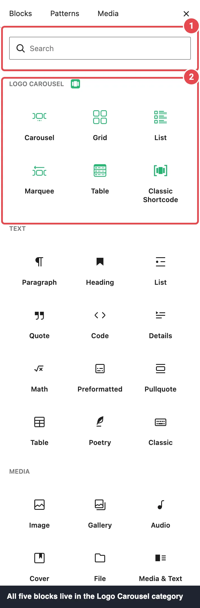
- Click the block. It appears with a start screen titled Create Your Logo Showcase.
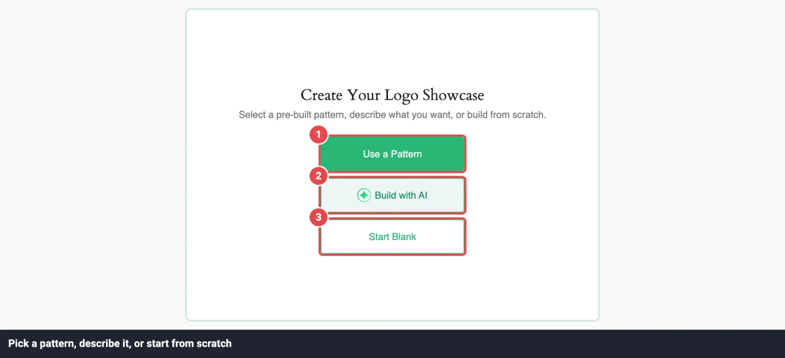
- Choose how to start (see below), add your logos, then use the inspector — the settings sidebar on the right — to style the layout. Click Publish or Update when you're happy.
New blocks are inserted at wide alignment. You can change that from the block toolbar like any other block.
Three ways past the blank block
| Start with | What you get | Best when |
|---|---|---|
| Use a Pattern | A designed layout from the Ready Patterns library, filled with demo logos you swap for yours. | You want it to look good without deciding every setting. |
| Build with AI | A block configured from a sentence you type. See the AI Builder. | You can describe the result but don't know which settings get you there. |
| Start Blank | The Choose Logo Images screen, where you upload or pick your logos. | You know what you want. |
A button only appears when its feature is available: Use a Pattern needs the Ready Patterns module on, and Build with AI needs the AI Builder module on plus a configured AI provider. Start Blank is always there.
The Carousel page is your shared manual
Every block shares the same core panels: Logo Images, Display Elements, Tooltips, Scheduling, Motion Effects, and Advanced Settings. They're documented once on the Carousel page. The other block pages explain what's unique — usually the Layouts panel — and link back.
The five blocks
| Block | Best for | Styles | |
|---|---|---|---|
 | Carousel | A row of logos that slides on its own or with arrows and dots. The classic "trusted by" strip. | Standard, Center, Staggered Pro, Multi Columns Pro |
 | Grid | A still wall of logos that shows everything at once. | Standard Grid, Grid Strip Pro, Staggered Grid Pro, Zigzag Grid Pro |
 | List Pro | One logo per row with its name and description beside it — a partner or member directory. | Left, Center, Right |
 | Marquee Pro | A ticker that scrolls endlessly with no stops. Great for sponsors. | Standard, Wave, Ribbon (Cross or Single) |
 | Table Pro | Logos in tidy columns — image, title, description — with an optional header row. | One style |
Using the free version?
You'll see List, Marquee, and Table in a separate Logo Carousel Pro Blocks category in the inserter. Those are previews that point you to the upgrade, not working blocks. See Free vs Pro.
Still deciding? Use this cheat sheet
Ask yourself one question: how should visitors take in the logos?
- They watch a row slide past, or click through it → Carousel.
- It should keep moving by itself, smoothly, forever → Marquee.
- They see every logo at once → Grid.
- Each logo needs a name and a few words → List, or Table if you want it to read like a spreadsheet.
- There are lots of logos and visitors need to find one → Grid, List, or Table with the Ajax Live Filter, Ajax Search, and Pagination. The partner directory tutorial shows the whole setup.
What each block can do
Most features work in every block. These are the differences:
| Feature | Carousel | Grid | List | Marquee | Table |
|---|---|---|---|---|---|
| Navigation arrows & pagination dots | ✅ | — | — | — | — |
| Pagination (Load More / numbers) | — | ✅ | ✅ | — | ✅ |
| Ajax Live Filter & Ajax Search | ✅ (not Staggered) | ✅ | ✅ | Standard & Wave only | ✅ |
| Display Elements (title, description, read more) | ✅ | ✅ | ✅ (on by default) | Standard full; Single Ribbon title only | ✅ (on by default) |
| Tooltips | ✅ | ✅ | ✅ | Standard & Single Ribbon only | ✅ |
| Logo details popup | ✅ | ✅ | ✅ | ✅ | ✅ |
| Scheduling & Motion Effects | ✅ | ✅ | ✅ | ✅ | ✅ |
| Table header row (Table Titles) | — | — | — | — | ✅ |
Filtering, search, pagination, Display Elements, tooltips, popups, scheduling, and motion effects are Pro features. Free vs Pro has the full list.
Where your logos come from
Every block gets its logos the same way: you upload images or pick them from your WordPress Media Library, and the block keeps its own list. Each logo can carry a title, alt text, link, description, and categories. The full walkthrough is on Adding Logos.
There's no "content source" to choose — no post queries or external feeds. A block shows exactly the logos you've added to it.
Changed your mind? Transform instead of rebuilding
Pro Any Logo Carousel block can turn into any of the other four. Select the block, click its icon at the start of the block toolbar, and pick another block under Transform to.Your logos always come across. So do the settings both blocks understand — image settings, Display Elements, Tooltips, and so on. The layout itself resets to the new block's defaults, apart from your filter and search switches, and settings only the old block had (like Carousel's navigation arrows) are dropped.
Full detail is on Carousel → Transforming a block.
Turning blocks on and off
Don't need Table on this site? Open Dashboard → Blocks and switch it off. A switched-off block disappears from the inserter. Your page content isn't deleted, but don't switch off a block that's in use on live pages — turn it back on and it returns as it was.
Next steps
- New? Follow the Quick Start, then build with the Carousel.
- Learn the logo workflow on Adding Logos.
- Want a designed starting point? Try Ready Patterns.
- Rather describe it than build it? See the AI Builder.
- Prefer shortcodes? See the Classic Version.
- Something not working? Troubleshooting and the FAQ.